


Design comparison
SolutionDesign
Solution retrospective
Hello~ Interesting challenge but not that so easy.
My problems here:
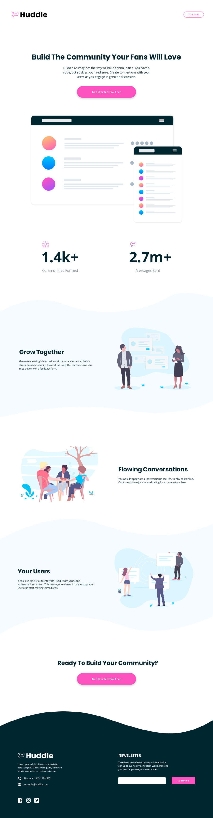
- Handling the different curves around the sections for the desktop and mobile version. I guess there is a way to make it more efficient for the code here. Any suggestions are all welcome^^
- For a 375px<page width<1440px, the rendering is really strange when it comes to sections with curves. In this challenge, should we worry about the design for a width included between these 2 values or not?
Thank you & Happy coding! 😊
Community feedback
- @vanzasetiaPosted over 1 year ago
Hi, @keziarkts! 👋
About your questions:
- You have done a great job with the curve background patterns. You decided to make them as background images for each section. You should have done the same thing for the curve background pattern of the
<footer>. - The sizes on the
style-guide.mdhave nothing to do with the media queries. They are telling you that "this is how your website should look like at these screen sizes". As a front-end developer, you should make your website looks good at all screen sizes, including smaller, larger, and everything in between.
I have some suggestions to improve your solution.
- Any words that are related to "image" (for example, picture, photo, logo, icon, graphic, and avatar) should not be included in alternative text.
- For images containing text, make sure the alternative text includes the image's text. In this case, the Huddle logo should have an
altvalue of “Huddle”. Reference: Checklist - The A11Y Project #for-images-containing-text-make-sure-the-alt-description-includes-the-images-text - Not every image needs alternative text. Decorative images should not have alternative text (
alt=""). This will tell the screen reader to skip over the image. As a result, it saves screen reader users time navigating the page. - For your information, decorative images are images that don't add any information and serve only aesthetic purposes.
- Use CSS to uppercase the text. It is not recommended to uppercase it manually within the HTML. Screen readers might spell the uppercased word in the HTML (spelled letter by letter).
- Use one
@importrule to import both Google Fonts. Even better, I recommend using<link>tags to improve the page performance.
I hope my suggestions help you. Happy coding! 😄
Marked as helpful2@keziarktsPosted over 1 year ago@vanzasetia thank you for your feedback and suggestions! 😊👍
0 - You have done a great job with the curve background patterns. You decided to make them as background images for each section. You should have done the same thing for the curve background pattern of the

Please log in to post a comment
Log in with GitHub
Join our Discord community
Join thousands of Frontend Mentor community members taking the challenges, sharing resources, helping each other, and chatting about all things front-end!
Join our Discord