Submitted over 2 years ago
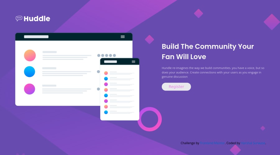
Responsive Huddle landing page by using the Flexbox in CSS.
@HarshalFSD
Design comparison
SolutionDesign
Solution retrospective
its difficult to visualize, what is need to design this content. so finally I used the flexbox for responsiveness.
Community feedback
- @shashreesamuelPosted over 2 years ago
Hey good job completing this challenge
Keep up the good work
Your solution looks great however I think the title and the description needs to be a bit bigger. Secondly the color of the button text needs to be the color specified in the
style-guide.mdfile.I hope this helps
Cheers Happy coding 👍
Marked as helpful1@HarshalFSDPosted over 2 years ago@TheCoderGuru
Thank you very much for your feedback. it will works as booster for my motivation.🙏0
Please log in to post a comment
Log in with GitHubJoin our Discord community
Join thousands of Frontend Mentor community members taking the challenges, sharing resources, helping each other, and chatting about all things front-end!
Join our Discord
