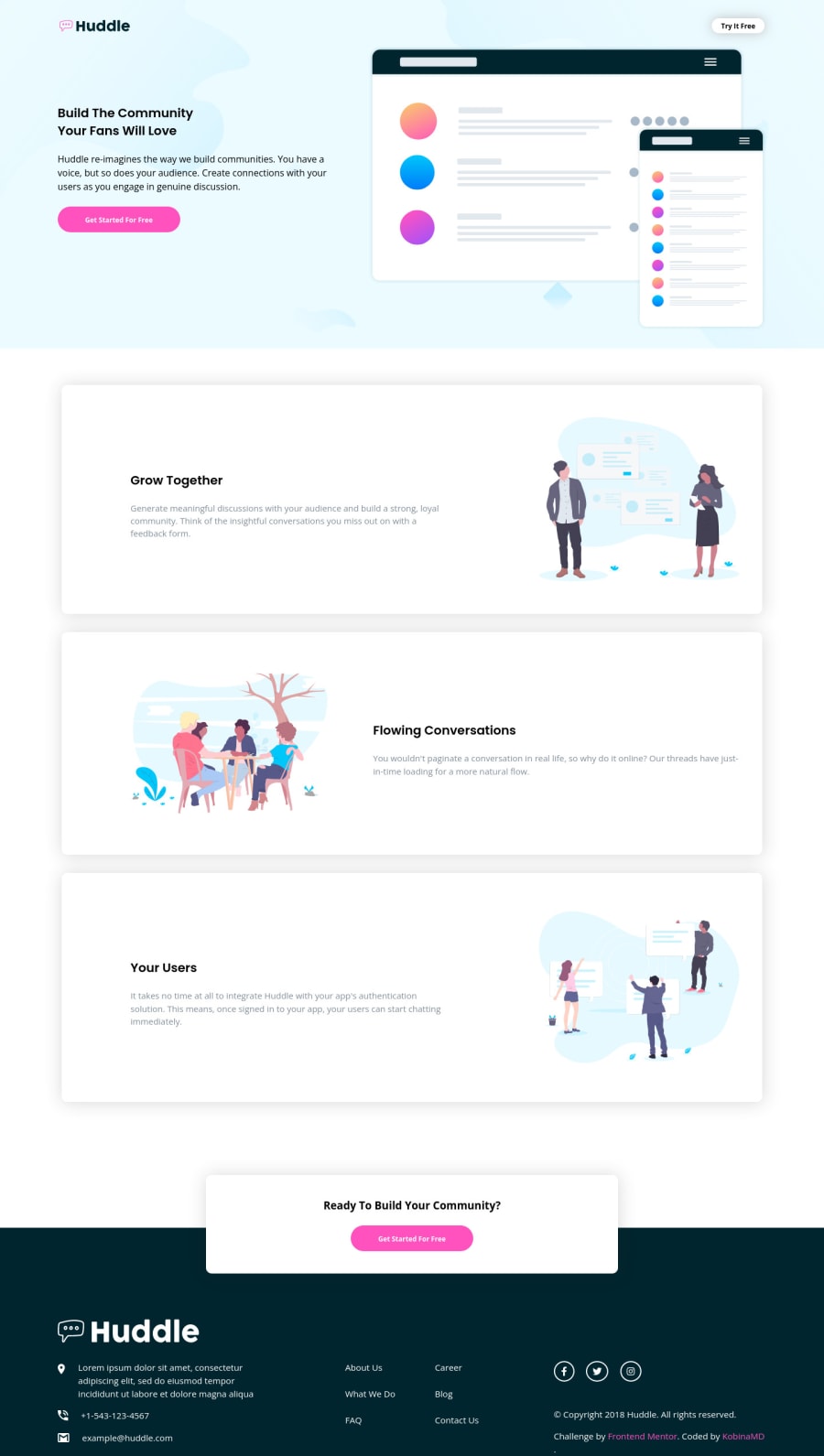
Design comparison
Solution retrospective
What is the best way to use icons? How do one get the middle sections to stay the same height?
Community feedback
- @grace-snowPosted about 3 years ago
Hi @Kobinamd
This looks pretty good, but be careful to follow the style guide. It looks like your font size, logo and buttons etc are smaller than they should be.
The main suggestions for improvement on this are with html, only a few css
- I’m not sure why navbar is positioned absolutely (?) that could cause problems as you are taking it out of the document flow
- look up how to write alt text correctly and when to leave blank - most of the descriptions on this are pretty meaningless
- this is missing landmarks. It should have a header, main and footer as direct children of the body
- I don’t think what you have as a nav at the moment qualifies as a nav. But the footer should definitely have a nav element
- consider using the address element in the footer for logo and contact info
- you are importing loads of unused css on this. That can be a huge performance hit. You only need a few icons for this, so it would be much better to just download those svgs and include them in your project
- as already stated, you must always include content or labels on anchor tags
- make sure you always include focus-visible and hover styles on interactive elements too.
I hope this is helpful
Marked as helpful2 - @jenniekibiriPosted about 3 years ago
Hey @Kobinamd
Good work on mobile design almost a perfect match, however on desktop I think you should try to make the hero section responsive on larger screens
You should also work on the folder organization of the stylesheet specifically ..have the UI library files separated from the custom stylesheets.
Hope it helps!!
Marked as helpful1 - @vanzasetiaPosted about 3 years ago
👋 Hi Kobinamd!
Regarding your questions:
- The easiest way to use font awesome is the following:
- First, go to cdnjs.com;
- Then, search for "font" (ignore the double quotes);
- Choose the first option, font-awesome @ 5.15.4
- Next, you can choose the
all.min.css
and click the code icon to get the code below 👇
<link rel="stylesheet" href="https://cdnjs.cloudflare.com/ajax/libs/font-awesome/6.0.0-beta2/css/all.min.css" integrity="sha512-YWzhKL2whUzgiheMoBFwW8CKV4qpHQAEuvilg9FAn5VJUDwKZZxkJNuGM4XkWuk94WCrrwslk8yWNGmY1EduTA==" crossorigin="anonymous" referrerpolicy="no-referrer" />
- Then, you can put the
link
inside thehead
tag. - To test that the link is working or not, you can simply put try to put this
span
inside the body element. If it is working you should see a big Facebook icon.
<span class="fab fa-facebook fa-5x"></span>
- To have the same height on those cards, what I did was making sure that the paragraph element has 3 lines (following the design).
I have some feedback on this solution:
- You have to put text inside the anchor tag. You can put the social media name inside it.
<a href="https://facebook.com" target="_blank" class="fa fa-facebook"> <span class="sr-only">Facebook</span> </a>
- You can search the styling of the screen reader only (sr-only) class.
- The solution doesn't responsive start from
750px
width screen size.
That's it! Hopeufully this is helpful!
Marked as helpful1 - @KobinamdPosted about 3 years ago
Thank you all for your wonderful feedback. I will make the changes.
0
Please log in to post a comment
Log in with GitHubJoin our Discord community
Join thousands of Frontend Mentor community members taking the challenges, sharing resources, helping each other, and chatting about all things front-end!
Join our Discord