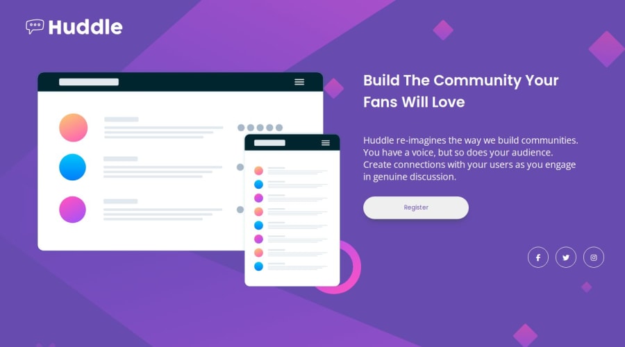
Design comparison
Solution retrospective
Questions for the Community
I would appreciate feedback on the following areas:
-
Responsive Design:
- How well does the page respond to different screen sizes?
- Any suggestions for improving responsiveness?
-
CSS Structure:
- Is the CSS well-organized and easy to follow?
- Are there opportunities to make the code more modular or DRY?
-
Accessibility:
- How accessible is the page, especially for users with assistive technologies?
- Any recommendations for improving accessibility?
-
Code Optimization:
- Are there areas where the code could be more efficient or optimized?
- Suggestions for improving performance?
-
General Code Quality:
- Are there best practices that I might be missing?
- Any potential issues or areas of improvement?
Feel free to provide any additional comments or insights you think would be helpful. Your feedback is valuable, and I appreciate your time in reviewing my solution!
Community feedback
- @rayaattaPosted 10 months ago
Hello 👋Bn-Bushra, congratulations on completing another challenge 🎉
1 I think your page is pretty responsive I have tested it on three devices.
2 Since the illustration mock up image is decorative its alt attribute should be left empty.
"Images with no semantic meaning—such as those which are solely decorative—or of limited informational value, should have their alt attributes set to the empty string (""). " - Mdn webdocs
You can check out this article
3 I noticed you set
outline:none
on the button. Setting outline to none on interactive elements is another immediate and serious accessibility failure. Keyboard users must be able to see where they are on the page. Focus-visible styles should be a bold and obvious outline that has a contrast ratio of at least 3:1 with surrounding colors.lastly You should add
cursor:pointer
to clickable elements to give user's a visual cue.I hope this helps 🙃
I loved your solution, especially the focus on semantics and accessibility,great job👏
Happy coding ✌️
Marked as helpful1@Bn-BushraPosted 10 months ago@rayaatta
This was really helpful and eye-opening. I have implemented these corrections and I really appreciate them. I forgot to add
cursor:pointer
because I used smartphone to design it. If you have any more information on how to make to make it easy for keyboard user navigation across page, I'll appreciate.1@rayaattaPosted 10 months agoI'm glad my suggestions helped
About keyboard navigation. Here is a great article about it@Bn-Bushra
1
Please log in to post a comment
Log in with GitHubJoin our Discord community
Join thousands of Frontend Mentor community members taking the challenges, sharing resources, helping each other, and chatting about all things front-end!
Join our Discord