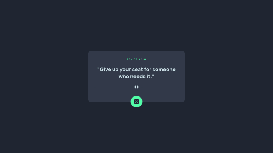
Design comparison
Community feedback
- @Bayoumi-devPosted over 2 years ago
Hey Hugo, It looks good!... Here are some suggestions:
- Use
<button class="dice-div">instead of<div class="dice-div">... Buttons are used for actions.
<button class="dice-div"> <img class="dice" src="/images/icon-dice.svg" alt="Advice Generator"> </button>-
Use the
quotationelement instead of theheadingelement to add more semantics to your project... ---><q>: The Inline Quotation element -
Use
REMfor font size, It is a must for accessibility because px in some browsers doesn't resize when the browser settings are changed... See this article ---> CSS REM – What is REM in CSS?
Hope this help!... Keep coding👍
1@HugoMoncadaPosted over 2 years ago@Bayoumi-dev Thank you so much for your comment. I didn't know how not using REM affected some browsers, didn't know about quotations either, but now, thanks to you I know about those things and will apply them.
The button was pure laziness because of how "simple" the project was, I will change that mentality for future projects.Thanks again for letting me know how to improve this project. I appreciate it
Keep coding👍
0 - Use
Please log in to post a comment
Log in with GitHubJoin our Discord community
Join thousands of Frontend Mentor community members taking the challenges, sharing resources, helping each other, and chatting about all things front-end!
Join our Discord
