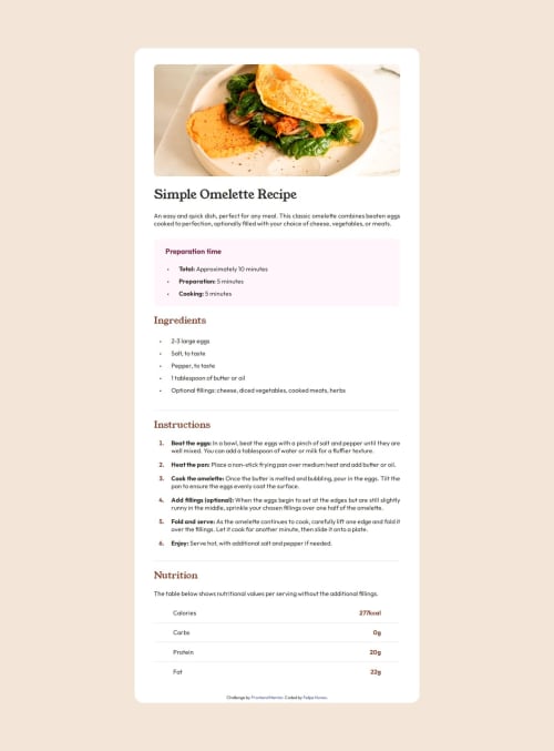
Responsive html page using only html and css resources

Solution retrospective
i think my site looks like the original design and i'm proud of it, but i need to study more to make less work around
What challenges did you encounter, and how did you overcome them?mainly the spacement challenges, because i didn't sutied about the paddings and margins yet but i can get by this situation
What specific areas of your project would you like help with?there is a nutritional table in the last portion of the site, i couldn't figure out how to solve the spacament problem, because in the original design there is a medium gap between the words and the numbers, and i could only think in the property : justify-content: space-between; but this property made a big gap between the contents and that wasn't what i was looking for
Please log in to post a comment
Log in with GitHubCommunity feedback
No feedback yet. Be the first to give feedback on felipenwn's solution.
Join our Discord community
Join thousands of Frontend Mentor community members taking the challenges, sharing resources, helping each other, and chatting about all things front-end!
Join our Discord