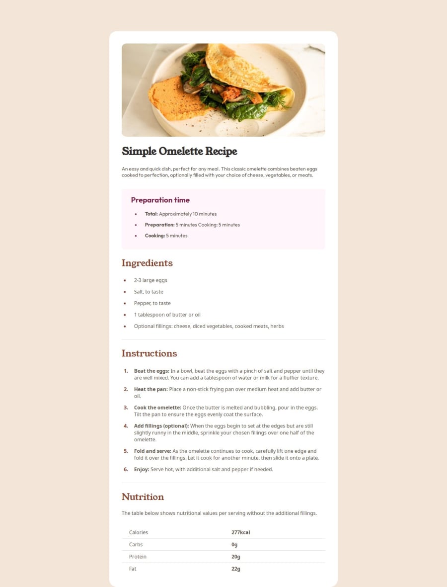


Design comparison

Solution retrospective
I can't say I'm proud of something here, but I feel that's a good start to actually START to code. It's a big difference between watching someone coding and coding by yourself so it gives you good practice and makes you try to find solutions for the problems you are facing during creating this project.
I found out some new HTML tags during this project (e.g. table tag), got better understanding of fundamentals of both HTML and CSS and of course @media tag which is required to make this layout responsive, including mobile devices. That's a good start as I said!
What challenges did you encounter, and how did you overcome them?The most important thing I faced during this project is creating a mobile version of this page. I have never looked at @media tag before and its really important skill in my humble opinion. Some overall structure understanding is also a challenge for a newcomer here, but for me it was easier than that.
What specific areas of your project would you like help with?Firstly, I want overall opinion on this page. Does it work as it should? Is there any recommendations in terms of tags, maybe some coding tricks I could use to make my code more clear and the most important, is it good in terms of 'looking like example'. Also it would be amazing to get some recommendations how to work without figma since I'm not premium user. I know it's possible but the only way I could find some numbers is Photoshop. Are there some better ways to do it except figma?
Community feedback
- @adrian-reina-391Posted 11 months ago
it looks good, but It should have a margin-bottom too, in mobile view it should not have a border radius, check mine if you want
Marked as helpful0@PetyaBiszepsPosted 11 months ago@adrian-reina-391 hmmmm, weird. In my WebStorm it has no border radius on mobile, will look into it. Thank you for being attentive! <3
0 - @EFEELEPosted 11 months ago
It works wonderfully!!!
Visually, I would recommend adding a margin at the bottom in the mobile view.
Regarding the HTML tags, I would recommend replacing your div with the class page-layout with a <main> tag. This will help with your website's SEO!!
Marked as helpful0@PetyaBiszepsPosted 11 months ago@EFEELE thank you so much for your feedback! It's really nice to have advice from someone who has experience, even if it's some fundamentals <3
Will look into main tag so definitely use it next time and will make some experiments with it right now :D
0


Please log in to post a comment
Log in with GitHub
Join our Discord community
Join thousands of Frontend Mentor community members taking the challenges, sharing resources, helping each other, and chatting about all things front-end!
Join our Discord