Not Found
Not Found
Not Found
Not Found
Not Found
Not Found
Not Found
Not Found
Not Found
Not Found
Not Found
Not Found
Not Found
Not Found
Not Found
Not Found
Not Found
Not Found
Not Found
Not Found

Submitted

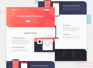
Responsive Home page, with mobile-first approach using HTML, Sass & TS

@Ahmed96Mah

Desktop design screenshot for the Blogr landing page coding challenge

This is a solution for...

  • HTML
  • CSS
  • JS
2junior
View challenge

Design comparison


SolutionDesign

Solution retrospective


Any feedback or recommendations would be greatly appreciated. Thanks :)

Community feedback

Alexei 831

@Batareika007

Posted

Hi Ahmed,

nice work on that challenge. I notice there is horizontally scrollbar on desktop, you can get rid of it by giving

body{
overflow-x: hidden;;
} 

or

id='intro'{
width:100vw; // remove it
}
main div#intro img.desktop{
width: 49vw; // 49 instead of 50
}

but then it can make other serious problem on mobile device. need to check more deeply what cause of that inside main tag. only there some issues with width

another advice, I think it will be good idea to put logo images inside a link, for example <a href="index.html" id="logo" ><img src="./images/logo.svg" alt="Company's Logo" ></a> at header and footer, its help users to navigate back to the page if there is need.

at footer you can make list instead of paragraphs like that:

<ul class="footerMenu">
  <li class="menuTitle">Product</li>
  <li class="menuItem"><a href="#">Overview</a></li>
  <li class="menuItem"><a href="#">Pricing</a></li>
  <li class="menuItem"><a href="#">Marketplace</a></li>
  <li class="menuItem"><a href="#">Features</a></li>
  <li class="menuItem"><a href="#">Integrations</a></li>
</ul>

it's just suggestion, your work looking really great

Marked as helpful

1

@Ahmed96Mah

Posted

@Batareika007

Thank you for that feedback :)

I have thought about wrapping the logos inside of an <a> tag, but the design's active state didn't show it to be an interactive element.

For the horizontal scrollbar, it is weird that it didn't appear while I am testing the design through multiple device widths (through chrome's devtool 'toggle device toolbar' feature), it has to be related to certain device widths.

Can you tell me your desktop or laptop device's inner browser dimensions so i can try to test it again. Thanks :)

And thank you again for the feedback :)

1
Alexei 831

@Batareika007

Posted

@Ahmed96Mah

now that I check it, it's really interesting, one's it appears and if I open and close devtool it's disappear. funny stuff. full width is 1920px

I create a video for better explanation, hope it will help. no one have access to that video, only who had a link, after you see it I will remove the video.

link to youtube video

Marked as helpful

1

@Ahmed96Mah

Posted

@Batareika007

Thank you for that video. It is weird because I opened chrome's devtool on the same width in 'responsive mode' and I don't see any scroll bar.

However I am using chrome for mac. But on my brother's laptop which have windows the scroll bar appears :0

Note: by the way I had a problem with my all projects where I didn't set the wide screens media query's height to a low enough value. That is why the mobile design (with the navbar) appeared on your laptop screen :(

But, I have fixed it now :)

anyway, I will look into that more.

Thank you Alexei :)

1

@Ahmed96Mah

Posted

@Batareika007

Hello Alexei,

I have searched about the problem, and found the reason for it. So, I thought I would share it with you.

The reason for you seeing a horizontal scroll bar while I couldn't, is because of macOS system preferences as scroll bars are NOT visible by default. While on windows, the vertical scroll bar exists by default. So, the existence of that vertical scroll bar conflicted with a rule set for the div with id 'intro', in which, I set its width to 100vw, which results in a x-overflow that occurs due to the horizontal space occupied by the scroll bar.

So, I fixed this by using 100% instead for the width property, and that fix the problem.

Thank you for the feedback, as I wouldn't have noticed that without it.

This question on stack overflow has helped me understand the reason for the problem.

Thank you again, and have a nice day :)

1
Alexei 831

@Batareika007

Posted

@Ahmed96Mah

Hello Ahmed,

Thanks for sharing, it's really great to figure out the problem and you did a great research to find an perfect solution for that issue. I glad that we can help each other and learn new stuff :)

thank you, have a great day, and happy coding :)

1

Please log in to post a comment

Log in with GitHub
Discord logo

Join our Discord community

Join thousands of Frontend Mentor community members taking the challenges, sharing resources, helping each other, and chatting about all things front-end!

Join our Discord