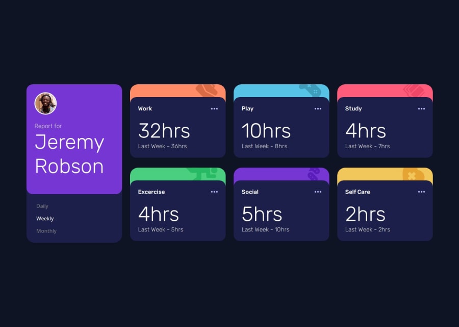
Responsive grid with hover and dynamically loading data


Design comparison

Solution retrospective
I'm so proud of the layout, it took me several hours to perfect but I think it looks really good.
What challenges did you encounter, and how did you overcome them?My biggest challenge was getting the rounded of the cards. I couldn't understand how to get it so that the bottom of the card appeared rounded underneath the top of it, I found out I had to use the background colour of the top of the card and then set another background colour for the bottom of the card whilst rounding it out.
Some other challenges I faced included trying to get the javascript to work on my server (it worked fine in localhost) but I think this was a chacing issue as it worked fine through private browsing. Another challenge I faced was with the icons and overflow:hidden not actually hiding the content.
What specific areas of your project would you like help with?I'd like help with my styling, i'm sure there was a faster way to write my stylesheets (or a better) Perhaps I could've used container queries? Is this a good way to go?
Community feedback
- @MarziaJaliliPosted 3 months ago
Nice work!
Here's a more concise way for the card:
- First, you can use the <section> element instead of the <article>.
The <article> element is used when its content is fully independent, but here the card is somehow related to other parts of the page.
-
Second, you don't need to set a whole separate <div> for the top border of the card.
-
Take the code below as an example for html:
<section> <div class="card-content"> <div class="head"> <span>study</span> <img src="./images/icon-clock.svg" alt="dots"> </div> <Strong>2hr</Strong> <span>Yesterday - 2hrs</span> </div> </section>- Then, you can simply apply the code below for styling it:
section {
  background-color: orange;
  /* the orange background will be only shown for the border
  /* use these line to set the border */
  padding-top: 2rem;
  background-image: url("./images/icon-view.svg");
  background-repeat: no-repeat;
  background-position: top right 10%;
}

.card-content {
  background-color: gray;
  display: grid;
  gap: .5rem;
}

.head {
  display: flex;
  justify-content: space-between;
}
You can change the border's color and the image's url for each card by having separate class names or using the
:nth-child()selector.The web looks cool overall, you're doing great!
😎😎😎
1

Please log in to post a comment
Log in with GitHub
Join our Discord community
Join thousands of Frontend Mentor community members taking the challenges, sharing resources, helping each other, and chatting about all things front-end!
Join our Discord