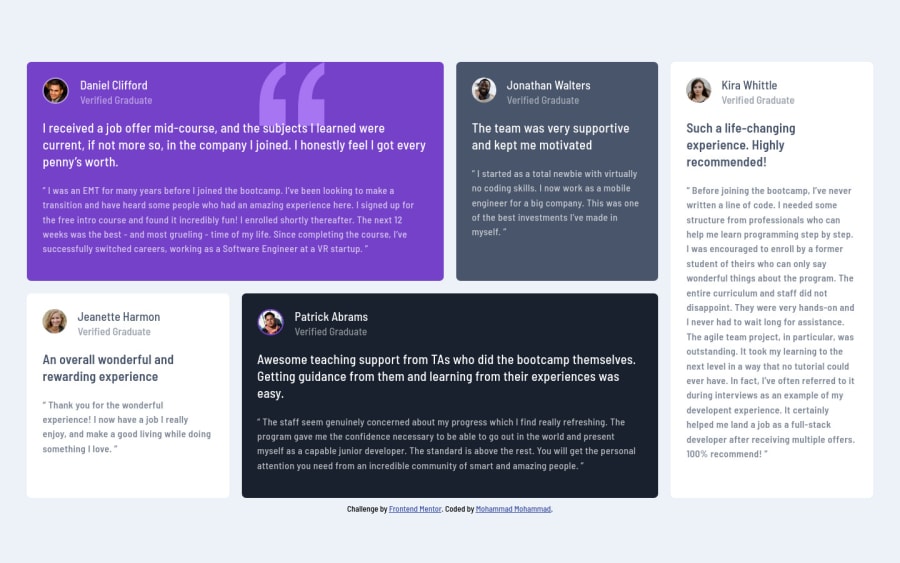
Design comparison
Solution retrospective
It took a lot of time & effort from me. I hope you like it guys!
Community feedback
- Account deleted
Hey there! 👋 Here are some suggestions to help improve your code:
- To center you content to your page, add the following to your Body Element:
body { min-height: 100vh; display: grid; place-content: center; }-
Add a
max-widthto you component’s container to prevent it from warping in large screens. -
The names of each individual are headings so they should be wrapped in a Heading Element.
-
To enhance the semantics of your component, you want to wrap each individual testimonial component in a Figure Element, the individuals information should be wrapped in a Figcaption Element and lastly, the testimonial itself should be wrapped in a Blockquote Element.
Code:
<figure>
   <figcaption></figcaption>
   <blockquote></blockquote>
</figure>
More Info:
- Implement a Mobile First approach 📱 > 🖥
With mobile devices being the predominant way that people view websites/content. It is more crucial than ever to ensure that your website/content looks presentable on all mobile devices. To achieve this, you start building your website/content for smaller screen first and then adjust your content for larger screens.
If you have any questions or need further clarification, let me know.
Happy Coding! 👻🎃
Marked as helpful0
Please log in to post a comment
Log in with GitHubJoin our Discord community
Join thousands of Frontend Mentor community members taking the challenges, sharing resources, helping each other, and chatting about all things front-end!
Join our Discord
