Design comparison
SolutionDesign
Community feedback
- @hadodevPosted 7 months ago
Hello @VISHALKANNAN070!
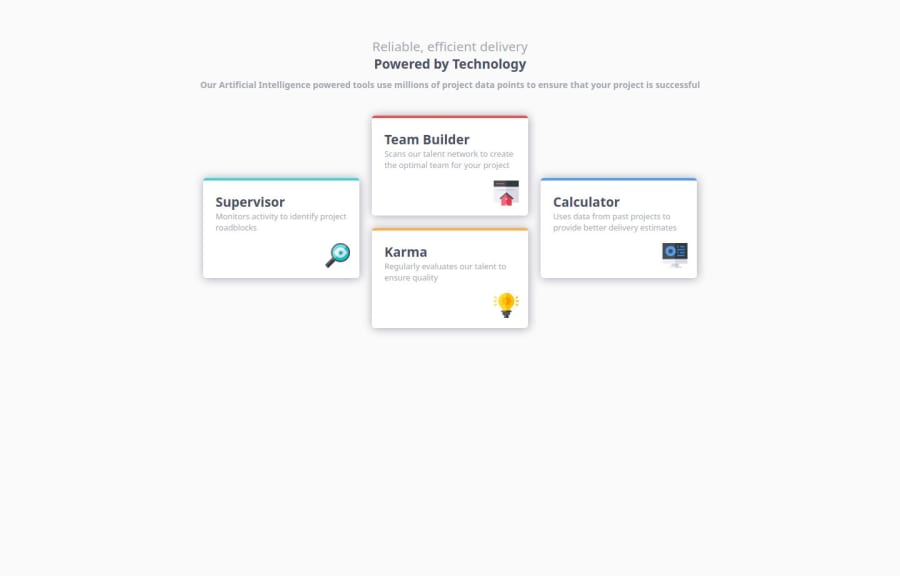
Your solution looks nice and almost like the design. My recommendations:
- I think it's an issue about the font. In your
style.cssfile you've used this statement:@import url( https://fonts.google.com/specimen/Poppins;);which has a bug. Try the following:@import url('https://fonts.googleapis.com/css2?family=Poppins:wght@200;400;600&display=swap'); - The
h6included in<div class='header'>doesn't much the design width. Try to usemax-width: 50ch;(update the number to your requirement). - Try to achieve better spaces between the elements inside the four cards.
Keep going!
0 - I think it's an issue about the font. In your
Please log in to post a comment
Log in with GitHubJoin our Discord community
Join thousands of Frontend Mentor community members taking the challenges, sharing resources, helping each other, and chatting about all things front-end!
Join our Discord
