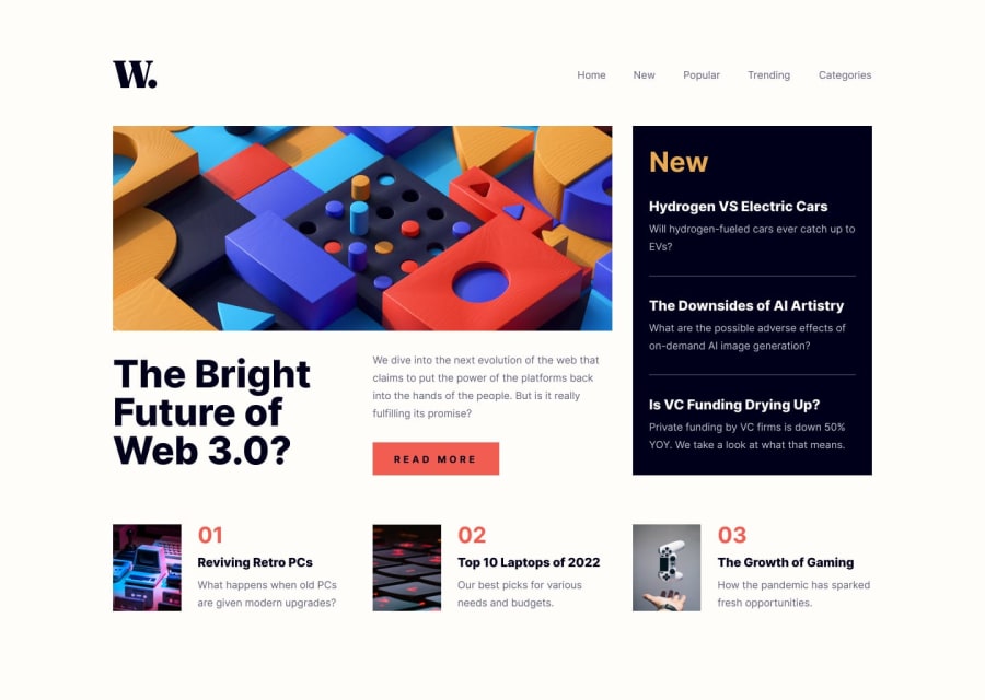
Design comparison
Solution retrospective
I didn't use the hamburger image giving so I'm not sure of the code written down
I will attend to any question relating to html css and js relating to the task given
Community feedback
- @AdrianoEscarabotePosted about 2 years ago
Hi Awizee, how are you?
Welcome to the front-end mentor community!
I really liked the result of your project, but I have some tips that I think you will enjoy:
If we see how the layout is behaving at higher resolutions, with the help of google dev tools, we will see that it is stretching a lot, to solve this we can use a max-width with the value we want the content to stop growing and to center use a margin: 0 auto;
body {
  max-width: 1440px;
  margin: 0 auto;
}
The rest is great!
I hope it helps... 👍
Marked as helpful1@awizeePosted about 2 years ago@AdrianoEscarabote thanks for your feedback I'm really grateful
1 - @Suleman-TasawarPosted about 2 years ago
The Challenge look perfect.I think there are something that you want to improve First the navigation links are hard to read i don't think that is the color that should be used as navigation link.Also there is too much padding on the top and bottom of the side bar you can look upto it.One last thing the head of the first blog is missing(The sidebar). I hope you like my feedback. Happy coding
Marked as helpful1@awizeePosted about 2 years ago@Suleman-Tasawar thanks for your feedback I'm really grateful I think that's the font color giving for the navigation
0
Please log in to post a comment
Log in with GitHubJoin our Discord community
Join thousands of Frontend Mentor community members taking the challenges, sharing resources, helping each other, and chatting about all things front-end!
Join our Discord
