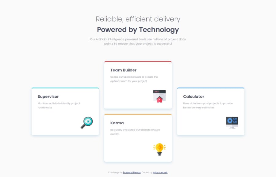


Design comparison

Solution retrospective
In this challenge I used a combination of custom properties, a media query and responsive sizing using the clamp() function. With these tools and the Figma file, I was able to achieve the responsive layout, and make smooth sizing transitions for elements like the h1 and the icons, and padding differences inside and between the cards. Next time I might use grid-template-areas instead of using line based placement when working with grid.
Getting the sizing to match the design/Figma files as close as possible took some trial and error. First I matched as close as possible to the mobile using static sizing in rem units. When that looked good, I noted what differences I saw in the desktop version. Where I thought it would be a good opportunity to use a function to fluidly transition to different font sizes and/or padding, I tinkered with clamp() and the devtools responsive view until my sizes were matching in both mobile and desktop. By 'sizes', I mean the h1, icons, and spacing (padding, margin, gap).
There were several decisions I made that I had doubts about being the best practice, so I will explain my thought process, and if you see how I can improve please let me know:
I used flexbox in the body, and grid only in the wrapper which contains the 4 cards. I needed just a one-directional vertical alignment to stack my and. Inside my element, I have an which contains my and. I didn't see any need to include those in and complicate the grid.
I do wonder if this is good use of the element. I thought since there is no navigation here, wouldn't be correct.
For the cards I used and for each card. Is this the right situation for use a list for cards, and if so, when is it correct to add the attribute role="list"?
Implementation of the grid itself. It was easy to get the layout here, but it could have been done also using `grid-template-areas'. I like using the shorthand:
.card-1 {
    grid-area: 2 / 1 / 4 / 2;
  }
But if this is not recommended then I want to correct my ways.
Thank you!

Join our Discord community
Join thousands of Frontend Mentor community members taking the challenges, sharing resources, helping each other, and chatting about all things front-end!
Join our Discord