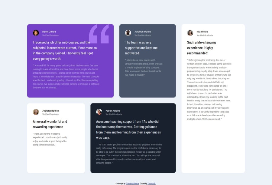


Design comparison

Solution retrospective
I focused on trying css grid (which I don't use usually because I feel more comfortable with flexbox). I also used Tachyons again partly since there is no css grid classes in tachyons (as far as I know at least).
What challenges did you encounter, and how did you overcome them?Working on the sizes and colours without having the Figma designs was a bit time consuming. I can always bring a screenshot on Figma and take from there exact measurements, which I partly do, but this is very time consuming and I don't want to spend so much time on it. So the layout is not pixel perfect but accurate enough for what I want to achieve.
What specific areas of your project would you like help with?Semantic html choices. I was a bit puzzled and not sure if I made the right choices at the end.
Community feedback
- @manuel360Posted 6 months ago
Great work!!. But one thing i would like to say about your layout is your width(grid-column-templates) and your height(grid-row-templates), make the column about 10-20rem wider with some minmax and 1fr and make the row auto.
Marked as helpful0 - @meghaspatil1Posted 6 months ago
superb both i and you used grid-area, but used some area as a b c d liked idea way of approaches
0


Please log in to post a comment
Log in with GitHub
Join our Discord community
Join thousands of Frontend Mentor community members taking the challenges, sharing resources, helping each other, and chatting about all things front-end!
Join our Discord