Design comparison
SolutionDesign
Solution retrospective
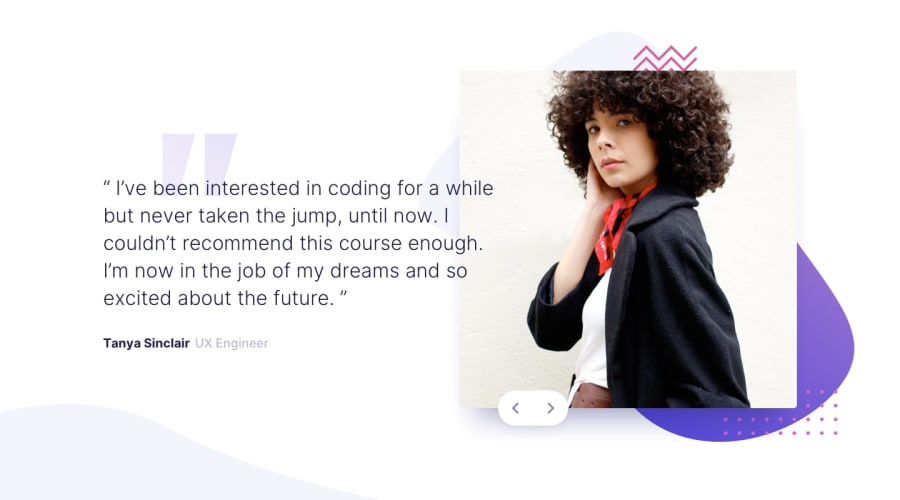
I'm not really sure about absolute positioning. Maybe it's just me and I need more exprience but I think of position: absolute as desperate move on those control buttons. Is there any other way to place them correctly or absolute is still way to go for placing items like this?
Anyway, I had fun making this challange. Tips and feedback as always are welcome!
Community feedback
Please log in to post a comment
Log in with GitHubJoin our Discord community
Join thousands of Frontend Mentor community members taking the challenges, sharing resources, helping each other, and chatting about all things front-end!
Join our Discord
