
Submitted over 2 years ago
Responsive GitHub User Search with Vite, TailwindCSS, Grid, Flex
#tailwind-css#typescript#vite#react

@cbserra

Design comparison
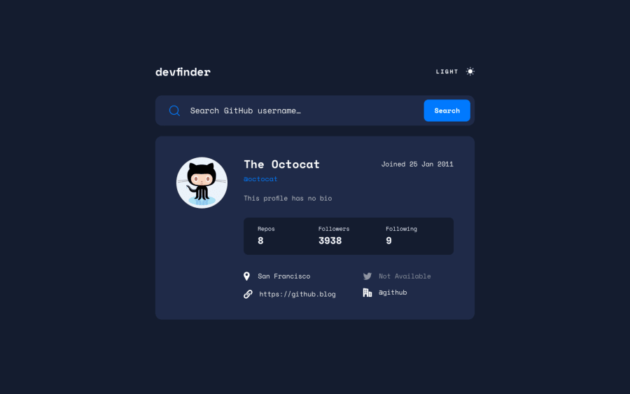
SolutionDesign
Community feedback
- @matt-o-westPosted over 2 years ago
Hello! Your layout is very nice, and the page looks responsive on all devices, which is great! A couple issues that I see:
- Your input field is getting cut off on desktop (it's running short of the wrapper)
- I can see the theme context is built into the project with react dev tools (and the screenshot shows this as well), but the theme toggle isn't working
- Your api call is working, but something looks to be off with your user state (problem is probably in Githubsearch.tsx), as whenever I enter a username, it brings me to the user briefly before reverting back to the octocat user
- The search icon should probably have 'aria-hidden="true"' on it so the screenreader doesn't read it
Hope this helps!
Marked as helpful1@cbserraPosted over 2 years ago@matt-o-west appreciate your input! I think I just submitted it prematurely, however, the API was working earlier, so I think I may have broken something while refactoring.
Also, was having issues with sizing the input bar across the 3 display sizes, and allowing room for the error message. Not sure if I need to look into
flex-shrink/flex-growfor those elements, or what.Thanks again!
0

Please log in to post a comment
Log in with GitHub
Join our Discord community
Join thousands of Frontend Mentor community members taking the challenges, sharing resources, helping each other, and chatting about all things front-end!
Join our Discord