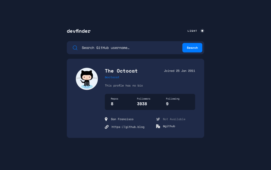
Design comparison
Solution retrospective
I learned about how useful BEM notation is. It really herlped in making the theme swicth design easier. I also learnt more about how fetch works and status codes as well as how to access the data in the object. I couldn't figure out how to automate the theme switcher and wrote each heme indivdually
What specific areas of your project would you like help with?I would appreciate advice on styling the margin under the image as I could not figure out how to position it like how it is on the design file. I also didn't add the prefer color scheme as I didn't understand it very well. I will still try though
Community feedback
Please log in to post a comment
Log in with GitHubJoin our Discord community
Join thousands of Frontend Mentor community members taking the challenges, sharing resources, helping each other, and chatting about all things front-end!
Join our Discord
