Submitted about 1 year ago
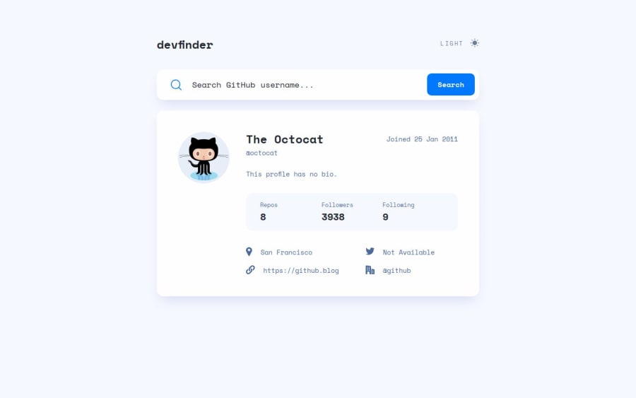
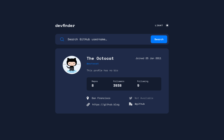
Responsive Github user search app. Fetch API. Light/dark themes.
@ortalyarts
Design comparison
SolutionDesign
Solution retrospective
What are you most proud of, and what would you do differently next time?
This solution selects the correct color scheme chosen based on user's computer preferences. Please let me know if it doesn't work on your machine :) or if you spot any other issues.
Community feedback
- P@lumiukoPosted about 1 year ago
Hello, great solution so far. I've noticed some small bugs in your app.
- If I type something into the text input and press enter, it refreshes the page. You can fix this behavior by adding the "submit" event on the form instead of "click" on the button and using event.preventDefault.
- When the text input is empty and I click "Search", the image seems like it can't be loaded. To improve UX, you can just not do anything but display the error message near the button.
- On mobile screens, the error message overlaps the input field and placeholder.
- Also, in the mobile view, I can't scroll the content. The solution is to remove "overflow: hidden" from the body.
Marked as helpful1@ortalyartsPosted about 1 year agoHello @lumiuko, thank you for taking time! Your advices were really helpful!
1
Please log in to post a comment
Log in with GitHubJoin our Discord community
Join thousands of Frontend Mentor community members taking the challenges, sharing resources, helping each other, and chatting about all things front-end!
Join our Discord
