Submitted 11 months ago
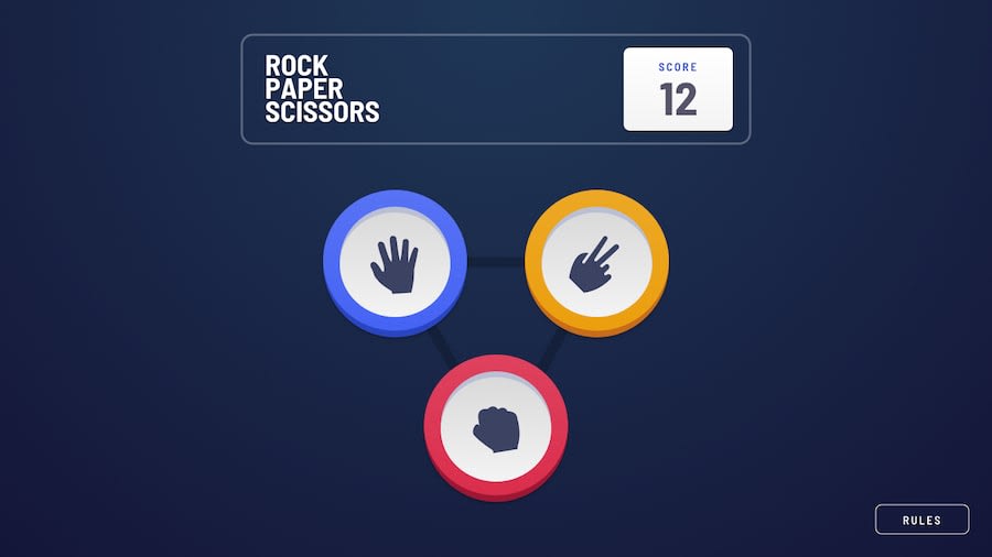
Responsive game built with react, css
#react
@Uyimolo
Design comparison
SolutionDesign
Solution retrospective
What are you most proud of, and what would you do differently next time?
I really loved building this game. The positioning and alignment for the individual moves (lizard, rock, paper etc) was quite interesting, gave me a chance to go over my absolute positioning with transform:translate(). I loved implementing this design.
I added a game score refresh icon that returns the score to zero when clicked.
What challenges did you encounter, and how did you overcome them?Styling the component that contains each move was a little challenging but I had to think outside the box and used a another div to simulate a hard shadow at the bottom of the move div.
Community feedback
Please log in to post a comment
Log in with GitHubJoin our Discord community
Join thousands of Frontend Mentor community members taking the challenges, sharing resources, helping each other, and chatting about all things front-end!
Join our Discord
