Design comparison
SolutionDesign
Community feedback
- P@hikawiPosted 6 months ago
Great work overall!
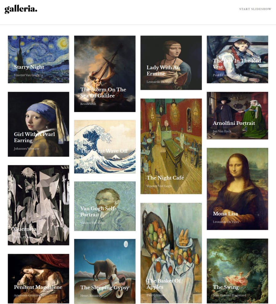
On the home page you're missing the hover states for the pictures and they are not interactive, I would prefer if they lead me to that section in the slideshow. The images here are stretched, probably because they appear in the wrong order.
Doing all this in pure vanilla JS is a crazy feat, so congrats on that.
0
Please log in to post a comment
Log in with GitHubJoin our Discord community
Join thousands of Frontend Mentor community members taking the challenges, sharing resources, helping each other, and chatting about all things front-end!
Join our Discord
