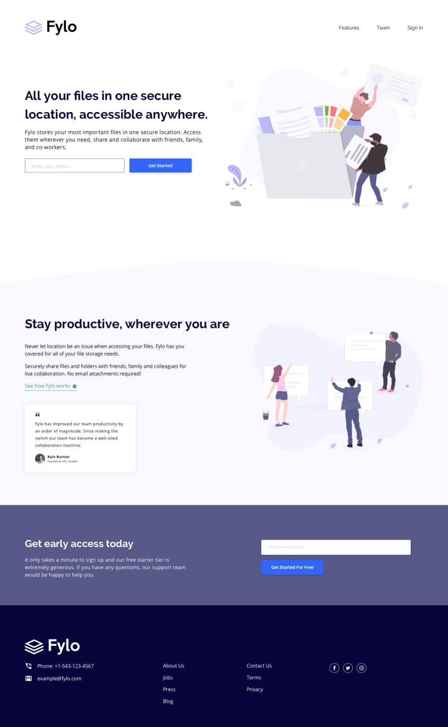
Design comparison
Community feedback
- @VCaramesPosted about 2 years ago
Hey @ghettobeast, some suggestions to improve you code:
-
The nav menu links have to wrapped in Anchor Tags so when users click on them, they are directed to another part of you site.
-
The Illustrations serve no other purpose than to be decorative; They add no value. Their Alt Tag should left blank and have an aria-hidden=“true” to hides it from assistive technology.
-
The headings are being used incorrectly. There can only be one <h1> Heading per page. Once the <h1> Heading has be used, you will use the next heading level and so on; depending on the headings' level of importance.
-
Your content is being pushed to the side, you want to look over you code and see what is causing that.
Happy Coding! 👻🎃
0 -
Please log in to post a comment
Log in with GitHubJoin our Discord community
Join thousands of Frontend Mentor community members taking the challenges, sharing resources, helping each other, and chatting about all things front-end!
Join our Discord
