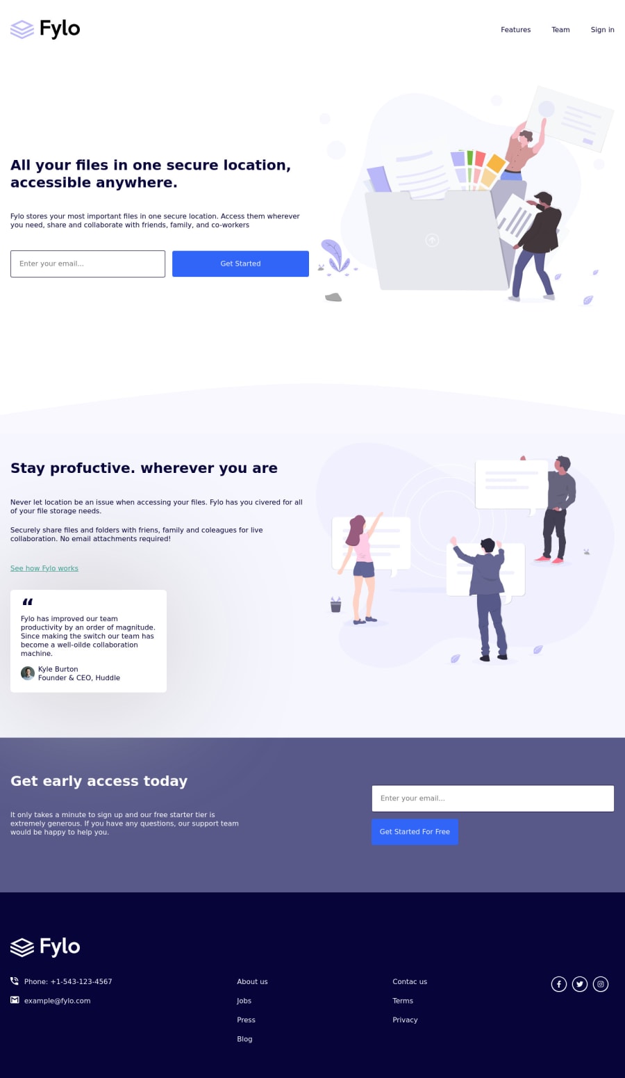
Design comparison
SolutionDesign
Solution retrospective
I managed to set pattern on email input, so box outline will turn red if user types some inappropriate symbols, but I have no idea what to make of input error message. Any feedback is welcome!
Community feedback
- @PhoenixDev22Posted about 2 years ago
Hello Twist,
Congratulation on completing this challenge. Excellent work! I have few suggestions regarding your solution, if you don't mind:
HTML
- The logo's alternate text should not be
logo
. You can use the website's name as an alternate text. You may setalt=”Fylo
.
- Images must have alt attribute. look up a bit more about how and when to write alternate text on images. Learn the differences between decorative/meaningless images vs important contentare For decorative images, you set an empty
alt
to it with anaria-hidden=”true”
to remove that element from the accessibility tree. This can improve the experience for assistive technology users by hiding purely decorative images.
- Profile images like that avatar are valuable content images, not decorative .For the alternate text of the avatar testimonial should not be empty . You can use the avatar’s name
alt=" kyle burton"
.
- For the testimonial, you may use
<blockquote>, <figure>, <figcaption>
- Never use
<div>
and<span>
alone to wrap a meaningful content. Just keep in mind that you should usually use semantic HTML in place of the div tag unless none of them (the semantic tags) really match the content to group together. For example , you may use like<address> ...
tag to wrap the contact information for the author/owner of a document or an article (email and phone number). By adding semantic tags to your document, you provide additional information about the document, which aids in communication.
- Use the
<nav >
landmark to wrap the footer navigation witharia-label=”secondary “
oraria-label=”footer”
. A brief description of the purpose of the navigation, omitting the term "navigation", as the screen reader will read both the role and the contents of the label. Thenav
element in the header could use anaria-label="primary"
oraria-label=”main”
attribute on it. The reason for this is that, you should add thearia-label
for a nav element if you are using the nav more than once on the page.you can read more in MDN
- Instead of using a generic div to wrap the footer’s navigation links and social links
.col
, you put your links within an unordered list structure**<ul>** so that a screen reader will read out how many things are in the list to give visually impaired users the most information possible about the contents of the navigation.
- In this instance
<p>About Us</p>
, it does not navigate the user anywhere. You should use interactive element<a>
, for example:<li><a href=”#”>About Us</a></li>
- Links must have discernible text. The social links wrapping the icons must have
aria-label
orsr-only
text indicate where the link will take the user. Your icons are purely decorative, you'll need to manually add an aria-hidden attribute to each of your icons.
- It should look like this:
<ul class=”col” > <li><a href=”#” aria-label="Visit our facebook<i class="fa-brands fa-facebook-f "aria-hidden=”true”></i></a></li> <li><a href=”#” aria-label="Visit our twitter"> <i class="fa-brands fa-twitter" aria-hidden=”true”></i></a></li> <li><a href=”#” aria-label="Visit our instagram"> <i class="fa-brands fa-instagram" aria-hidden=”true”></i></a></li> </li> </ul>
Aside these, you did great work. Hopefully this feedback helps.
Marked as helpful1@TwistusPosted about 2 years ago@PhoenixDev22 Thank you very much for such detailed feedback!!!!
0 - The logo's alternate text should not be
Please log in to post a comment
Log in with GitHubJoin our Discord community
Join thousands of Frontend Mentor community members taking the challenges, sharing resources, helping each other, and chatting about all things front-end!
Join our Discord