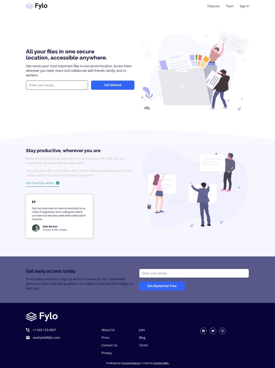
Design comparison
SolutionDesign
Solution retrospective
What are you most proud of, and what would you do differently next time?
I was able to create the form element and style appropriately. I was also able to add an error message if an invalid mail is entered, using just CSS, applying the :invalid css property. My first time of also using the :not() css selector.
What challenges did you encounter, and how did you overcome them?The biggest challenges I had were in determining whether the header contained only the nav, or whether the first section was meant to be in the header.
I also had big challenge in doing the error message for invalid email but i eventually found a way around it
Community feedback
Please log in to post a comment
Log in with GitHubJoin our Discord community
Join thousands of Frontend Mentor community members taking the challenges, sharing resources, helping each other, and chatting about all things front-end!
Join our Discord
