Submitted over 2 years ago
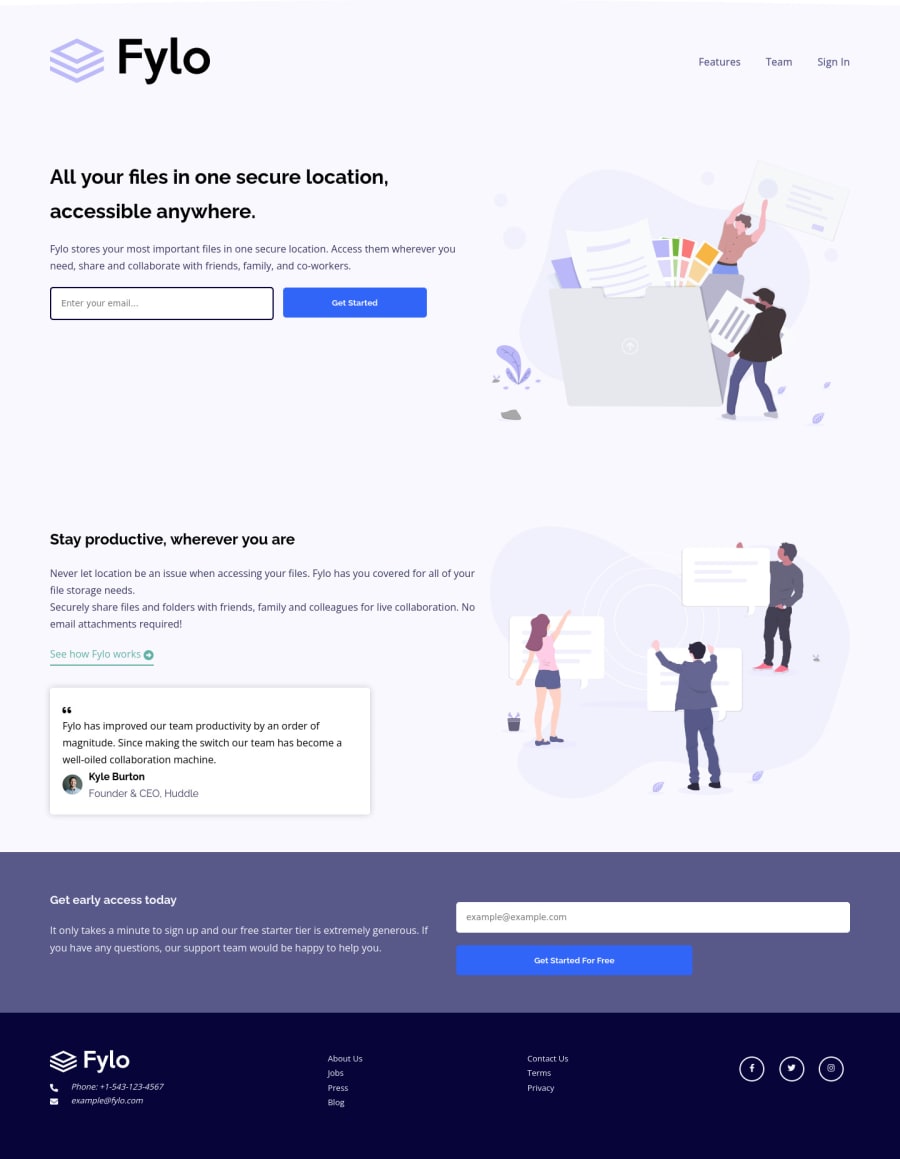
Responsive Fylo landing page using pure HTML and CSS
@garang-deng
Design comparison
SolutionDesign
Solution retrospective
As always, I'm open to any suggestions and feedback
Community feedback
- @PhoenixDev22Posted over 2 years ago
Hi Garang Deng,
Great work! I have some suggestions regarding your solution, if you don't mind:
HTML
- The logo's alternate text should not be
Main logo
. You can use the website's name as an alternate text. You may setalt=”Fylo logo"
.
- Use the
<form>
tag to wrap the<input>
and the<button>
.
- look up a bit more about how and when to write alt text on images. Learn the differences with decorative/meaningless images vs important content like
icon-phone, icon-arrow , icon-quotes
andicon-email
are decorative. For decorative images, you set an emptyalt
to it with anaria-hidden=”true”
to remove that element from the accessibility tree. This can improve the experience for assistive technology users by hiding purely decorative images.
- For the alternate text of the testimonials avatar should not include the word image , you can use only the avatar’s name
alt=" kyle burton"
.
- For the testimonial , you may use
<blockquote>, <figure>, <figcaption>
- Use the
<nav >
landmark to wrap the footer navigation witharia-label=”secondary “
oraria-label=”footer”
. A brief description of the purpose of the navigation, omitting the term "navigation", as the screen reader will read both the role and the contents of the label. Thenav
element in the header could use anaria-label="primary"
oraria-label=”main”
attribute on it. The reason for this is that, You should add thearia-label
for a nav element if you are using the nav more than once on the page.you can read more in MDN
- You may use the
<address>
tag to wrap the contact information for the author/owner of a document or an article (email and phone number.)
- Never use
<div>
alone to wrap a meaningful content. Just keep in mind that you should usually use semantic HTML in place of the div tag unless none of them (the semantic tags) really match the content to group together.By adding semantic tags to your document, you provide additional information about the document, which aids in communication.
- For the reason stated before, instead of using a generic
div
, Use the<ul>
to wrap the social links .
- The social links wrapping the icons must have
aria-label
orsr-only
text indicate where the link will take the user. Then you setaria-hidden =”true”
to the icons to be ignored by assistive technology.
It should look like this:
<ul class="social-icons"> <li class=""><a href="#" aria-label="Visit our facebook"> <i class="fa-brand fab fa-facebook-f" aria-hidden="true"></i></a></li> <li class=""><a href="#" aria-label="Visit our twitter"> <i class="fa-brand fab fa-twitter" aria-hidden="true"></i></a></li> <li class=""><a href="#" aria-label="Visit our instagram"> <i class="fa-brand fab fa-instagram" aria-hidden="true"></i></a></li> </ul>
Aside these , you did great work. Hopefully this feedback helps.
Marked as helpful1 - The logo's alternate text should not be
Please log in to post a comment
Log in with GitHubJoin our Discord community
Join thousands of Frontend Mentor community members taking the challenges, sharing resources, helping each other, and chatting about all things front-end!
Join our Discord