Submitted over 3 years ago
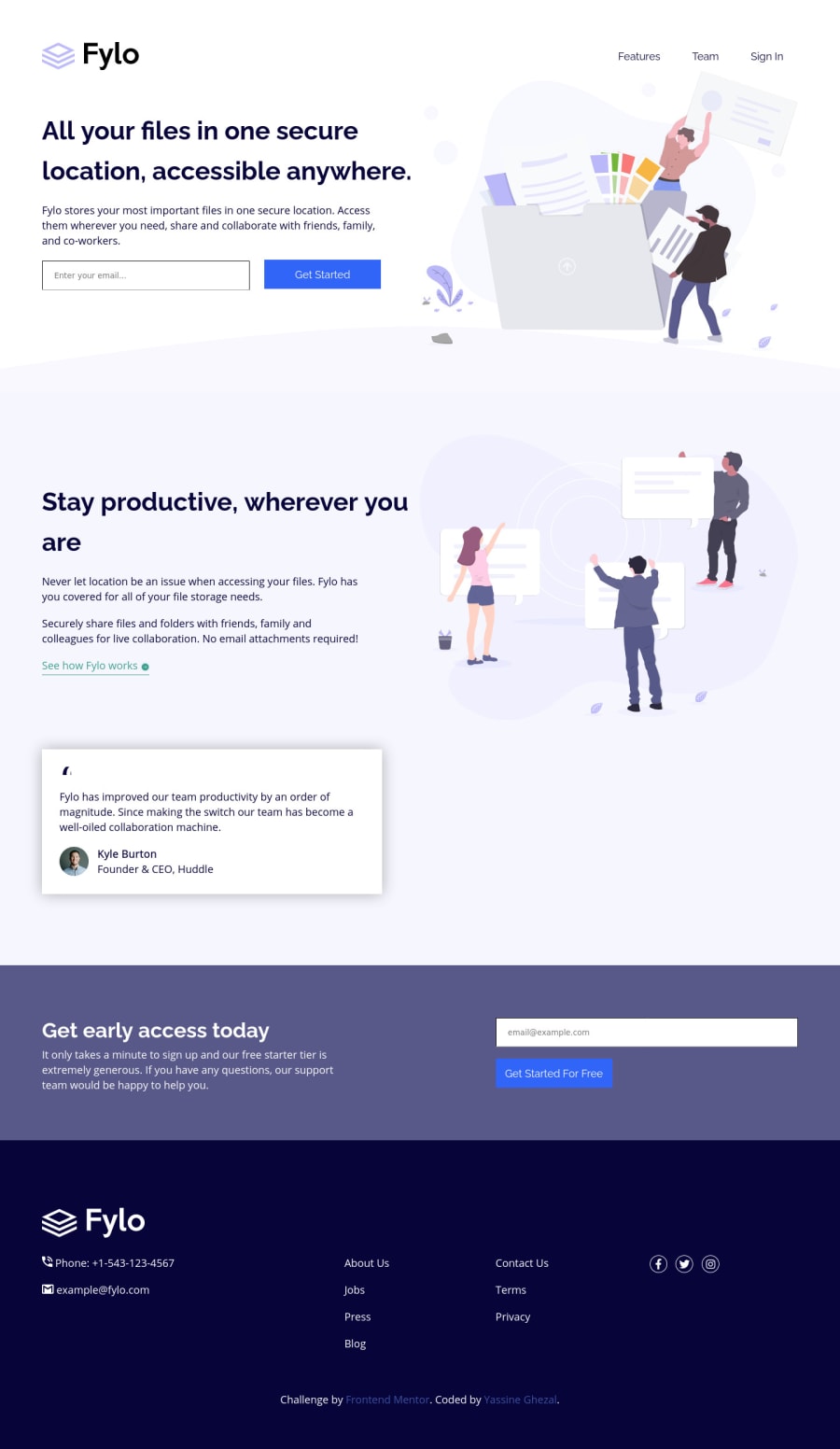
Responsive fylo landing page using HTML, CSS Grid and Flexbox
@Ryusuke66
Design comparison
SolutionDesign
Solution retrospective
Any feedback is appreciated.
Community feedback
- @ChamuMutezvaPosted over 3 years ago
- For a list , use a list
<div class="list"> <a href="#">Features</a> <a href="#">Team</a> <a href="#">Sign In</a> </div>- input elements should have a label
<input type="email" name="email" placeholder="Enter your email..."> - if the image is decorative ,use an
alt="". for eg<img src="images/icon-email.svg" alt="email">. alt values should be descriptive to aid assistive tech users to visualize the message that is being put across.
Marked as helpful1@Ryusuke66Posted over 3 years ago@ChamuMutezva i was going to change it to
<ul>list and forgot, thanks for reminding me.0 - @hafizanadliPosted over 3 years ago
What a great work!
Almost similar to design and responsive in every screen.
Keep up the great work!
1
Please log in to post a comment
Log in with GitHubJoin our Discord community
Join thousands of Frontend Mentor community members taking the challenges, sharing resources, helping each other, and chatting about all things front-end!
Join our Discord
