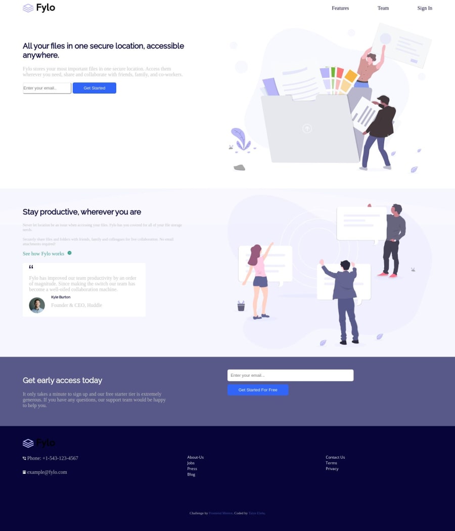
Design comparison
SolutionDesign
Solution retrospective
Please give your reviews. Thank you.
Community feedback
- @annesophie22Posted over 4 years ago
Hello Elelu, The overall design is here, good job ! You can improve your solution with quick improvements :
- by giving white space between your elements : play with padding or margin of your containers containing the main sections (nav, section 1 "all your files in 1 location", section 2 "stay productive wherever you are etc)
- I see in your code that your put your body font family between square brackets "Open Sans". This is preventing your CSS to compile this font family, that's why you do not have Open Sans as a font family in your final design (same for your a tags)
- I see also in your code that for your "footer" your planned a grid of 4 columns but you coded only 3 columns, the social media icons are missing. That should also be easy to fix since you already "prepared" your container with 4 columns. Keep the good job up ! Have fun
2
Please log in to post a comment
Log in with GitHubJoin our Discord community
Join thousands of Frontend Mentor community members taking the challenges, sharing resources, helping each other, and chatting about all things front-end!
Join our Discord
