Not Found
Not Found
Not Found
Not Found
Not Found
Not Found
Not Found
Not Found
Not Found
Not Found
Not Found
Not Found
Not Found
Not Found
Not Found
Not Found
Not Found
Not Found
Not Found
Not Found

Submitted

Responsive Fylo Data Storage Component

@nicoams

Desktop design screenshot for the Fylo data storage component coding challenge

This is a solution for...

  • HTML
  • CSS
2junior
View challenge

Design comparison


SolutionDesign

Solution retrospective
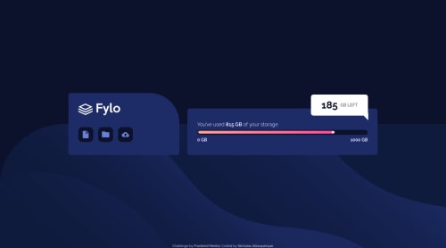

Hello guys.

I would appreciate some feedback on the progress bar.

Thank you in advance!

Community feedback

@michel-moreira

Posted

Hello Nicholas!

Great job on complete this challenge!

I have some suggestions tha might be helpful!

  • In the img tag, you must put an alternate text, the attribute "alt". The required alt attribute provides an alternate text for an image, if the user for some reason cannot view it (because of slow connection, an error in the src attribute, or if the user uses a screen reader). Source.

  • You must put a h1 tag on the pag cause the page should contain a level-one heading, you could replace the p tag and just maintain the class the same, so your code remains unchanged.

  • All your principal code should be wrapped by main tag landmark, between the tags main and div attribution you've putted a section tag to treat the second element. Would be better if you use 2 sections inside the main instead on main and a section out of the main. One section to the first element and other section to the second one. The main tag is more like a container and not an element itself.

  • Inside the tag section you could use a h1 heading level rather than p. And the div 'amount-left' you could use h2 as well.

  • Your div attribution could be replaced by the footer tag to be more semantic.

I hope you find it helpful!

Happy Coding!

0

@nicoams

Posted

@michel-moreira Hi there.

The main tag is wrapping all the content. The first element contains the logo and links so I used a header to wrap it (I think it works as a header, just in another position other than on top haha) and a section to wrap the "content".

I made others changes as you suggested.

Thank you for the feeback.

0

@Suleman-Tasawar

Posted

Hi there Nicholas your solution was quite creative but there are a few problems in the mobile view -The three icons are squeezed and causing the third icon to be hidden if your using flex then try changing it flex-direction

-The info bar that shows the amount of space left is swished in the progress bar

These are few things that i found which need to be improved

Happy Coding 🙃

0

@nicoams

Posted

@Suleman-Tasawar Hello!

I have made some changes and it works from min-width of 320px. It seems to be working fine now.

Thank you for the feedback.

1

Please log in to post a comment

Log in with GitHub
Discord logo

Join our Discord community

Join thousands of Frontend Mentor community members taking the challenges, sharing resources, helping each other, and chatting about all things front-end!

Join our Discord