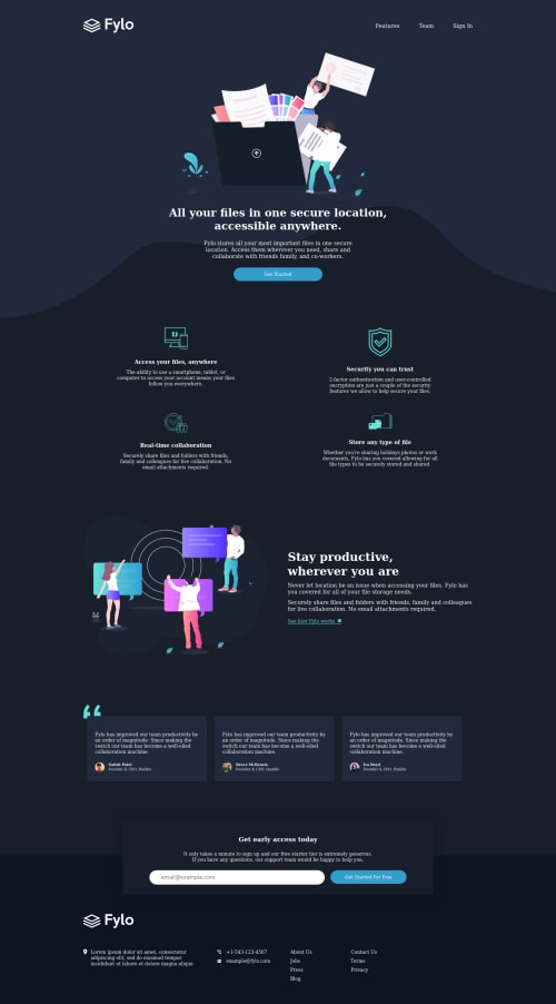
Submitted about 3 years agoA solution to the Fylo dark theme landing page challenge
Responsive Fylo dark theme landing page
@damagermax

Solution retrospective
Though I was able to achieve the desired result, I'm not sure if I am following the best practices. Any help, criticism, or feedback is welcome, I am here to learn!
Code
Loading...
Please log in to post a comment
Log in with GitHubCommunity feedback
No feedback yet. Be the first to give feedback on Maxwell Takyi's solution.
Join our Discord community
Join thousands of Frontend Mentor community members taking the challenges, sharing resources, helping each other, and chatting about all things front-end!
Join our Discord