


Design comparison


Solution retrospective
What are you most proud of, and what would you do differently next time?
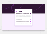
This FAQ Accordion challenge was a small and rather simple one, in the sense that it didn't require as much CSS and layouts, like some of the other full landing pages I've done. However, I was tempted to try it out anyways, as I knew it would be a test of my HTML and functional CSS skills ! This challenge was meant to be done with Javascript, but I knew it could be done with only HTML and CSS, and I gave it a go ! This was also a free challenge, meaning I did not have access to a Figma file this time around, and had to practice eye-balling the dimensions !
What challenges did you encounter, and how did you overcome them?
-
Functional CSS As I mentioned, this challenge was meant to be done with Javascript, but I knew it could be accomplished with just HTML and CSS, with a few tricks. I was aware that I could use the 'checkbox method' in order to accomplish this, utilising
input type="checkbox",label for, and the:checked:pseudo-class, in order to simulate click events ! That being said, it's my first time actually using this trick on my own, so I had to take my time with it, and I'm happy with the end result ! -
Background Positioning: I had some issues trying to get the background image to properly scale with with the viewport as I tested for responsiveness, in the end, with a few tweaks using
background-size, I managed to get it done.
What specific areas of your project would you like help with?
All feedback are welcome and appreciated !
Community feedback
Please log in to post a comment
Log in with GitHub
Join our Discord community
Join thousands of Frontend Mentor community members taking the challenges, sharing resources, helping each other, and chatting about all things front-end!
Join our Discord