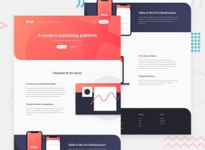
Design comparison
SolutionDesign
Solution retrospective
I have made it mostly responsive , I'd like to hear If there are any major changes to be made, How ever minor parts of header were not completed which will be done soon.
Community feedback
- @ChamuMutezvaPosted over 3 years ago
- to fix this issue raised in the report
Document should have one main landmark, you need to have amainelement in your html. You can try to use themainas a container for thesection'selements , such that you have aheader, main, footer - some of the nav items are best presented as list items , hence the need to have an unordered list for accessibility.
- the
btnHamburgeris supposed to be a button since its main purpose is to open and close the navigation list, an anchor element should be used for links that open other pages - heading elements must ascend in order without skipping headings (h1, h2, h3 etc)
- read about responsive images techniques , mainly srcset and picture element, the method below is not considered as best practice.
<div class="sec_2_hero_img"> <img class="hide-for-desktop" src="/images/illustration-phones.svg" alt=""> <img class="hide-for-mobile" src="/images/illustration-phones.svg" alt=""> </div>- there is still some few work to be done to make it responsive, on mobile content is not fitting on the screen.
Happy coding
0 - to fix this issue raised in the report
Please log in to post a comment
Log in with GitHubJoin our Discord community
Join thousands of Frontend Mentor community members taking the challenges, sharing resources, helping each other, and chatting about all things front-end!
Join our Discord
