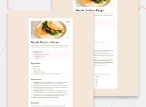
Design comparison
SolutionDesign
Community feedback
- @eros77scPosted 3 months ago
Hello! Congratulations on completing another challenge, it's very well done! Here are a few tips I noticed where you can improve:
- Your
intro-text<h1>receives a color described in the styleguide.md file and also gets font-weight: 400;. - In the "Preparation time" section, there is a box surrounding the section with a subtle color (almost transparent) described in the styleguide.md file.
- Great job using
::marker, but the color of the "Preparation time" markers is different from the other list markers. Also, the numerical list markers are bold. - The colors of the titles "Ingredients," "Instructions," "Nutrition," and the table numbers follow the same brown described in the styleguide.md.
- To better use Semantic HTML, there is no need to use
<span>in<li>. You can choose to use<strong>for the words highlighted in bold.
Keep up the good work, you're doing great!
Marked as helpful0 - Your
Please log in to post a comment
Log in with GitHubJoin our Discord community
Join thousands of Frontend Mentor community members taking the challenges, sharing resources, helping each other, and chatting about all things front-end!
Join our Discord
