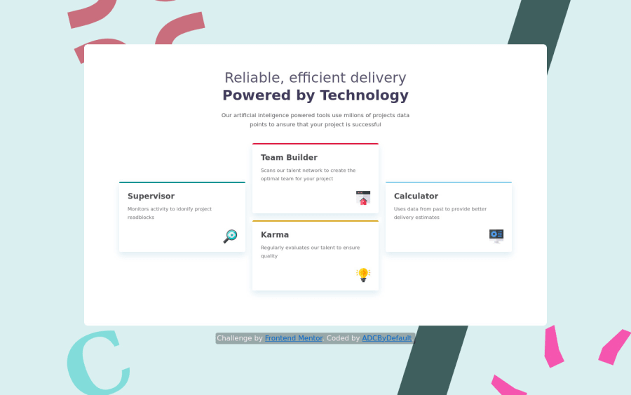
Responsive Four-card-feature-section using media queries and flexbox
Design comparison
Solution retrospective
Positioning the backgound was the difficult part, cause "height:100%" didnt worked on my placeholder so i decided to use "position:fixed; height:100vh;". Also i'm not sure if i used media queries correctly. I will happily accept any advice or corrections.
Community feedback
- @vanzasetiaPosted over 2 years ago
Hi! 👋
For this challenge, there's actually no background image. If you see the design comparison then you may notice that the original design doesn't have any background images. So, I would recommend removing it. It makes the challenge harder than it should.
A few suggestions for this solution.
- I would recommend making these two
h1as oneh1. You can wrap the other text content withspanto style it differently.
<h1 class="light">Reliable, efficient delivery</h1> <h1 class="bold">Powered by Technology</h1>- I suggest fixing all the issues that have been reported. You can learn more about the issue by clicking the "Learn More" link. But, if you still have questions about the issues then feel free to ask your questions to me. 😉
I hope this helps! Happy coding! 😁
Marked as helpful1@ADCByDefaultPosted over 2 years ago@vanzasetia yeah you're right, the challenge does not include the background, i got confused because in one of the design images it has the background (not the same i used), but i think i'm keeping it. For the h1 case, i'll definitely try it, should i use "</br>" ? to separate the heading? otherwise it will tends to stay just in one line.
0@vanzasetiaPosted over 2 years ago@ADCByDefault I am assuming that you follow the
design-preview.jpg. It's actually used as a preview image for theREADME.md`file. The other design files are what to use as a reference when building the project. 😉For the
h1case, you can usespanto wrap the second text. After that, make thespanas block element to make it sit on its line.Marked as helpful1@ADCByDefaultPosted over 2 years ago@vanzasetia yep, i'm taking notes, and span as blcock element works perfectly
1 - I would recommend making these two
- @Ibarra11Posted over 2 years ago
As far as the background, the height issue you encountered may be due to how percentages work with height . When using percentage with heights, the child will take up 100% of the parents height. But, if you don't give the parent an explicit height, its height will be the same as the height of the child. So, I am assuming the issue was that you never gave the html selector a height of 100%. When you give html a height of 100%, it is similar too 100vh where it takes up the full viewport. You would also have to give the body selector of 100% to take up the full height of the parent html element otherwise the height of the body is going to be as big as its children. For example, html, body{height: 100%};
Marked as helpful1@ADCByDefaultPosted over 2 years ago@Ibarra11 Thanks, i tried what you're saying. but it does not work. link to the image. The height of the place holder is still not the height of the body. Maybe my css is to messy or maybe the problem is in "display:grid" on body. But i'm leaving this as it is for now. Thanks again and sorry for bad English.
0
Please log in to post a comment
Log in with GitHubJoin our Discord community
Join thousands of Frontend Mentor community members taking the challenges, sharing resources, helping each other, and chatting about all things front-end!
Join our Discord
