Submitted almost 2 years ago
Responsive Four-Card-Feature-Section (CSS Grid/Flexbox)
@Slaks97
Design comparison
SolutionDesign
Solution retrospective
Hi!
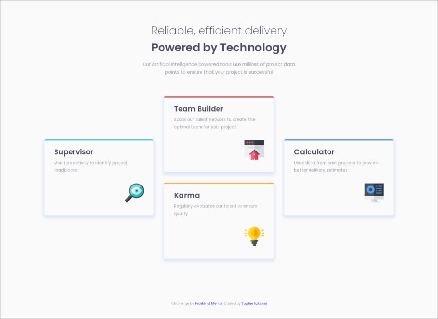
I implemented Grid on my .sections.
In my media query for larger screens, I then used Flexbox's align-self: center to center the .tools-sup and .tools-calc in their respective column.
- Is that a correct method or is there a better way?
I also set a height on all four .tools otherwise the containers would have different sizes as their content varied.
- Should I use a different property than height or min-height in my code to make those sections the same height when the webpage is displayed on wider screens?
I hope this makes sense and that someone will be able to assist me...always grateful for the help and guidance! :)
Community feedback
Please log in to post a comment
Log in with GitHubJoin our Discord community
Join thousands of Frontend Mentor community members taking the challenges, sharing resources, helping each other, and chatting about all things front-end!
Join our Discord
