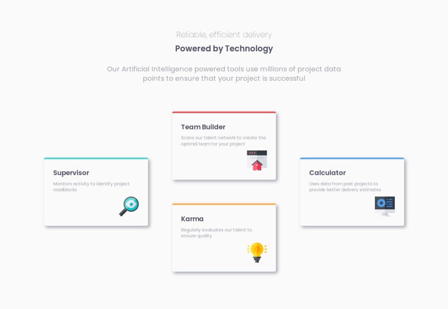
Design comparison
SolutionDesign
Solution retrospective
What are you most proud of, and what would you do differently next time?
1. How to use flex box and grid to build responsive layout
- Use flex box. Be familar with attributes like "flex-wrap","align-items","justify-content" and so on.
form {
  display: flex;
  align-items: flex-end;
  flex-wrap: wrap;
  gap: 16px;
}
.name {
  flex-grow: 1;
  flex-basis: 160px;
}
.email {
  flex-grow: 3;
  flex-basis: 200px;
}
button {
  flex-grow: 1;
  flex-basis: 80px;
}
- Use fluid type and space This makes the font size changing accordingly. It is based on a useful tool - utopia. But in this case, I only use "--step-0".
:root {
    --step--2: clamp(0.6rem, 0.5032rem + 0.4128vi, 0.8748rem);
    --step--1: clamp(0.75rem, 0.629rem + 0.5161vi, 1.0935rem);
    --step-0: clamp(0.9375rem, 0.7863rem + 0.6451vi, 1.3669rem);
    --step-1: clamp(1.1719rem, 0.9829rem + 0.8063vi, 1.7086rem);
    --step-2: clamp(1.4648rem, 1.2286rem + 1.0079vi, 2.1357rem);
    --step-3: clamp(1.8311rem, 1.5358rem + 1.2599vi, 2.6697rem);
    --step-4: clamp(2.2888rem, 1.9197rem + 1.5749vi, 3.3371rem);
    --step-5: clamp(2.861rem, 2.3996rem + 1.9686vi, 4.1714rem);
  }
- Use relative unit like rem
- Use media quires when necessary.
How can I develop the desktop design without using media quires, but using flex box or grid only?
I added one media query and in larger screen I used grid and specifically put different elements in different columns.
What specific areas of your project would you like help with?How can I develop the desktop design without using media quires, but using flex box or grid only?
Community feedback
- @john-miragePosted about 1 year ago
Hello, nice work !!
Why do you want to avoid using media queries ?
0
Please log in to post a comment
Log in with GitHubJoin our Discord community
Join thousands of Frontend Mentor community members taking the challenges, sharing resources, helping each other, and chatting about all things front-end!
Join our Discord
