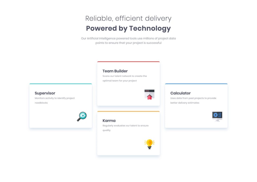
Responsive four-card-feature page, Mobile first, css grid & flexbox
Design comparison
Solution retrospective
Any suggestions to improve are welcome.
Community feedback
- @argelomnesPosted about 5 years ago
Hi Zeek,
This is pretty neat! Though I find your use of
brcreative, I think giving your article a bottom margin will give you more flexibility.2@odkpatrickPosted about 5 years agoThanks for the tip @argelomnes.
Ironically, I did use a bottom margin initially, but then decided to use the
brtag for some reason.0 - @mattstuddertPosted about 5 years ago
Great work on this challenge Zeek, your solution looks great! 👍
I would recommend only using
articleelements to wrap self-contained content that could live on its own without anyone knowing the wider context of the site. Examples would be blog posts, articles and forum posts. Here's a link to MDN for more details. In this instance, I would have the.cards-containeras asectionand then each of the cards asdivelements.Let me know if you have any questions!
0@odkpatrickPosted about 5 years ago@mattstuddert Thank you for the feedback and link.
I've updated the repo and I'll keep working on better semantic use.
0
Please log in to post a comment
Log in with GitHubJoin our Discord community
Join thousands of Frontend Mentor community members taking the challenges, sharing resources, helping each other, and chatting about all things front-end!
Join our Discord
