Submitted almost 3 years ago
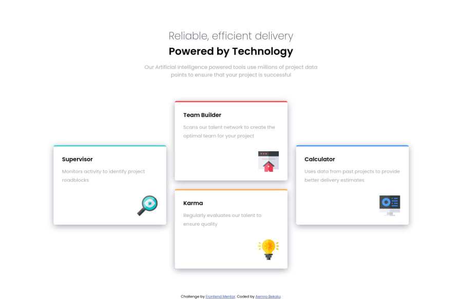
responsive four-card feautre challenge only by flexbox
@aemrobe
Design comparison
SolutionDesign
Solution retrospective
any feedback on how can I improve my solutions are welcome
Community feedback
- @grace-snowPosted almost 3 years ago
Hi
The heading is incorrectly aligned to the left on mobile with this - it should be centered according to the design
Other improvements I suggest;
- the heading on this is one heading not Two, it's all meant to be read as one. Make it into one h1 and make the strong tag inside display block to create the desired line break
- the icons in this are decorative. So they should have empty alt
- remove the section element in this. You don't need it, it adds nothing semantically anyway so you should be using a div there. Sections should only be used to wrap larger chunks of content that have a h2 at the start and deserve extra emphasis - to add the semantics sections need an aria labelledby pointing to the id of their heading.
Marked as helpful3
Please log in to post a comment
Log in with GitHubJoin our Discord community
Join thousands of Frontend Mentor community members taking the challenges, sharing resources, helping each other, and chatting about all things front-end!
Join our Discord
