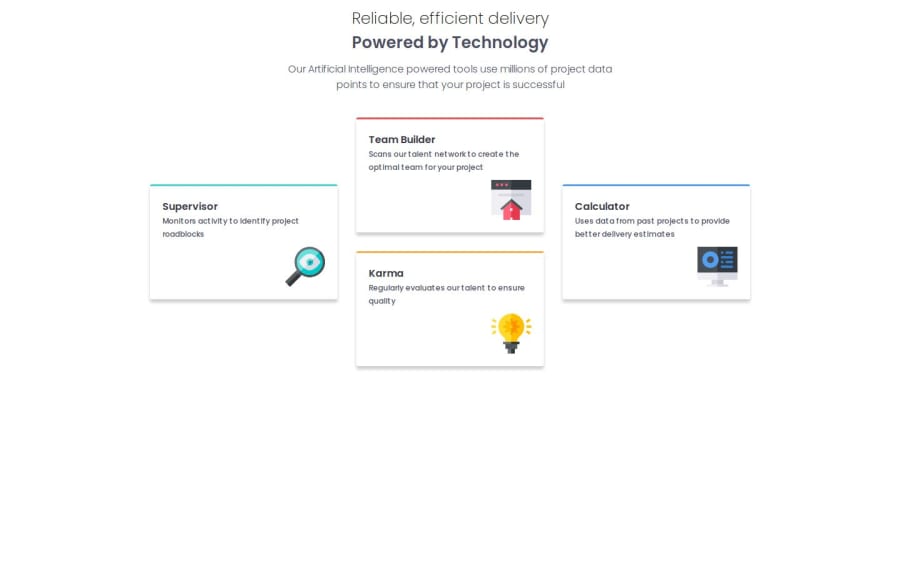
Design comparison
SolutionDesign
Community feedback
- @alaa-mekibesPosted 3 months ago
Hi @RanndaLL0, great job 🎉! Just a few points to fix:
- Center your layout using Flexbox or Grid. You can use the following examples:
- For Grid:
display: grid; place-items: center; min-height: 100vh;- For Flexbox:
display: flex;
justify-content: center;
align-items: center;
min-height: 100vh;
Note:
min-height: 100vh;ensures the layout takes up the full screen height.- Use CSS variables to improve maintainability, like this:
:root { --bg-color: hsl(210, 46%, 95%); /* Add your other colors here */ } body { background-color: var(--bg-color); /* Other properties */ }-
Change the
paragraphcolorto match the original design and add somemargin-bottomfor better spacing. -
I don't why you add style1.css style2.css index 1 index 2 this is confuse. I think you should give each project a repo.
Keep refining, it’s looking great so far!
1
Please log in to post a comment
Log in with GitHubJoin our Discord community
Join thousands of Frontend Mentor community members taking the challenges, sharing resources, helping each other, and chatting about all things front-end!
Join our Discord

