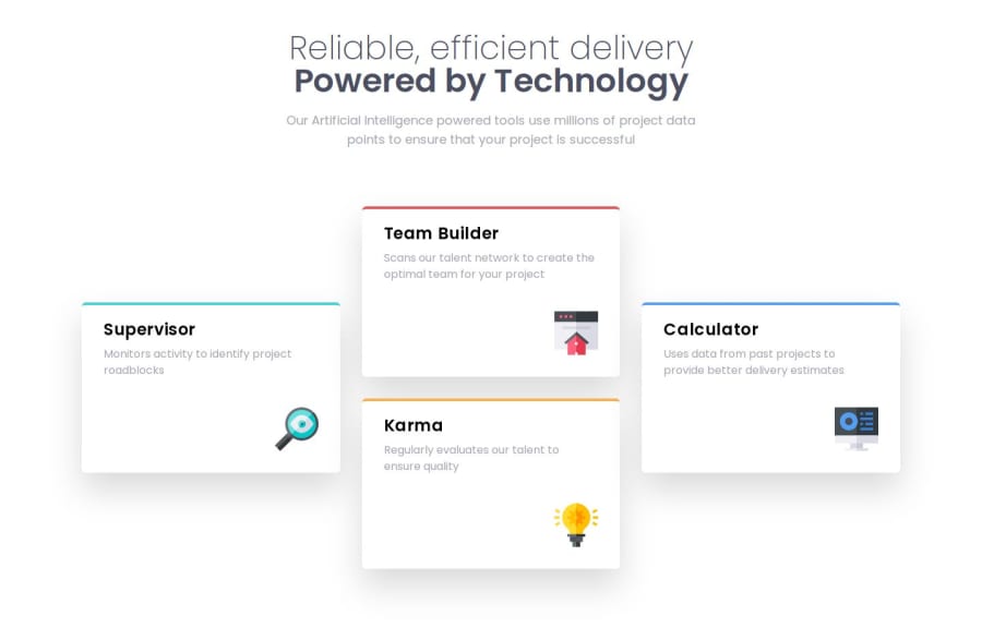
Responsive Four Cards with Vue 3, Tailwind CSS, TypeScript, Pinia
Design comparison
Solution retrospective
This project racked my brain a little bit because I wanted to use Pinia to populate the contents of the cards. I got to practice using type guards with TypeScript, and replace() to match image file path.
What specific areas of your project would you like help with?Any feedback is appreciated.
Community feedback
- @NeoScripterPosted about 2 months ago
I like your solution, it looks really neat and corresponds to the design. Two things I would recommend to improve:
- Add margin-top for large screens as now the title touches the upper viewport;
- Set user-select: none on cards to avoid selecting effect when you click on them.
The thing I'm curious about is why did you decide to use Vue for that? It doesn't have any interactive elements. You can't ulitize the advantages that Vue gives you as a JS framework. That's it, I hope it helps.
Marked as helpful1@FxGanangGHPosted about 2 months ago@NeoScripter
Thank you so much for your kind words and suggestions!
The main reason I chose to use Vue is to familiarize myself with the environment and basic features as I'm currently learning this framework. I'm focusing on aspects like Single-File Component (SFC) templates and Vue directives such as v-if.
I believe that getting comfortable with its environment and foundational directives on simpler projects is a good first step in building a solid foundation for more complex projects in the future.
0@NeoScripterPosted about 2 months ago@FxGanangGH Okay, makes sense. Well, good luck with learning, hope you master it!
1
Please log in to post a comment
Log in with GitHubJoin our Discord community
Join thousands of Frontend Mentor community members taking the challenges, sharing resources, helping each other, and chatting about all things front-end!
Join our Discord