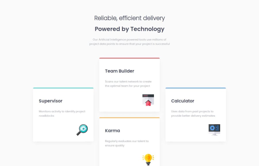
Design comparison
Solution retrospective
the responsiveness across platforms
What specific areas of your project would you like help with?Any enhancements to the code.
Please log in to post a comment
Log in with GitHubCommunity feedback
- @MohammedOnGit
Hello Ahmed Aziz!
Your HTML structure for the "Four card feature section" is well-organized, with clear sections and appropriate use of semantic HTML. Here are a few tips and improvements for accessibility and maintainability in addition to @StevenStroud's suggestions:
- Improve Heading Structure: The h1 in your header contains two separate span elements. This might not be necessary unless you are planning to style them individually. Keeping it as a single h1 with different styles for each line can simplify things.
- Accessibility Enhancements: Ensure that the alt text in your images provides useful context. For example, instead of "Supervisor icon", use "Icon representing a project supervisor" for better descriptive text.
- SEO and Meta Tag: You have a meta description, which is great! For SEO, also ensure the rest of your content (like h2 tags and paragraph texts) are descriptive enough to reflect the focus of the page.
These changes should enhance your design and ensure it adheres to best practices.
Marked as helpful - P@Stroudy
Hello again, It is nice to see some of the feedback I have given you in this project, Fantastic effort on this! You’re really nailing it. Just a few things I noticed that could make it even better…
- These
<span>should really have semantic tags like headings (<h1> to <h6>) and paragraphs (<p>) convey structure and meaning to content, improving accessibility, SEO, and readability by helping search engines and screen readers interpret the content.
<span>Reliable, efficient delivery</span> <span>Powered by Technology</span>- Here you should change your
max-width: 1200pxtorem,
.content-wrapper { max-width: 1200px; }- Change
font-size: 15px;torem,
body { font-size: 15px; }-
I think you can benefit from using a naming convention like BEM (Block, Element, Modifier) is beneficial because it makes your CSS more organized, readable, and easier to maintain. BEM helps you clearly understand the purpose of each class, avoid naming conflicts, and create reusable components, leading to a more scalable codebase. For more details BEM,
-
I think you could benefit from a plugin on VS code called Prettier, It will format your code make it more easily readable.
You smashes this solution! I hope you found this advice helpful! Keep up the great work, You’re doing amazing, and I can’t wait to see what you create next. Happy coding! 🚀
Marked as helpful - These
Join our Discord community
Join thousands of Frontend Mentor community members taking the challenges, sharing resources, helping each other, and chatting about all things front-end!
Join our Discord
