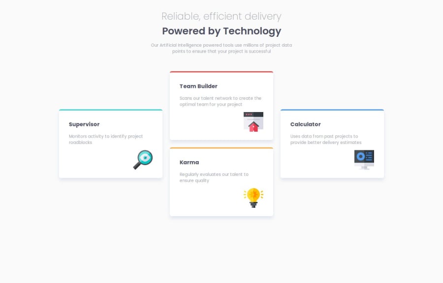
Design comparison
Solution retrospective
I am proud of learning how to use css grid properly and achieving a highly similar design to the one provided in the challenge
What challenges did you encounter, and how did you overcome them?just learning about the css grid
What specific areas of your project would you like help with?none
Community feedback
- P@MikDra1Posted 7 months ago
Nice one 😀
If you are curious how you can do this straight lines on the top of each card here is my tip:
Create another element in each of the cards. Then position this element absolute. Card should be positioned relative. At the end you need to give this element a height of 3px width of 100% and top 0 and left 0. You can also use ::after or ::before pseudo elements to create these.
Hope you found this comment helpful 💗
Good job and keep going 😁😊😉
1 - @flaviocmbPosted 7 months ago
Hi
The mobile version looks good but the desktop version need some improvements. You need to improve your eye technique to meet the elements requirements like font-family, font-size, font color, etc.
1
Please log in to post a comment
Log in with GitHubJoin our Discord community
Join thousands of Frontend Mentor community members taking the challenges, sharing resources, helping each other, and chatting about all things front-end!
Join our Discord
