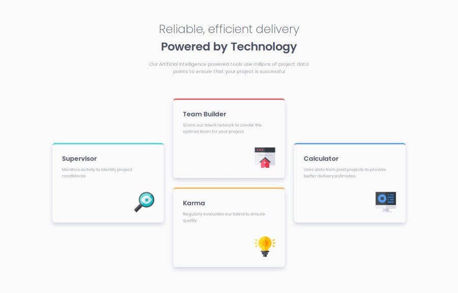
Responsive four card using scss


Design comparison

Solution retrospective
I will learn grid and flexbox more in-depth.
What challenges did you encounter, and how did you overcome them?Unable to achieve what I wanted to, by using the grid layout.
What specific areas of your project would you like help with?With the CSS review.
Community feedback
- P@CarlHummPosted 3 months ago
Hi Saumyadip
Good job. I see you've used sass and BEMCSS which is cool. I'm still getting use to mixins myself. Here are some suggestions I have for your solution.
- Fix overflowing container (.cards) at tablet breakpoint.
- Create an inbetween layout for tablets.
- Move the larger layout to a larger breakpoint
In the browser inspector I've re-written some rules to create a basic layout similar to the design. Here is the code.
Start with mobile styles
.layout {
    margin:0;
}

.cards {
    grid-template-columns: 1fr;
    grid-template-rows: auto;
    bottom: auto;
}

.cards .card {
    grid-area:unset;
    top:auto;
    bottom: auto;
}
Adjust design to fit comfortably
As each card has a fixed width of 350px, and the design has three columns, that means at bare minimum not including grid gutters or margins we would need 3*350px in width before we could display the design and have it looks good.
To solve this you could:
- Allow your columns and cards to shrink below 350 using grids fractional units or flexbox's flex.
- Adapt the layout and move the three column change to a larger breakpoint
@media screen and (min-width: 750px) {
    .cards {
        grid-template-columns: repeat(2, 1fr);  // Adapting to 50/50 design for tablets
        grid-template-rows: auto;
    }

}
Moving three column design to a larger breakpoint (based on fixed card widths)
This bit of code is similar to yours but I used the long-form (grid-rows and grid-columns) instead of grid-areas. The align-items:center makes it so that the cards that span both rows line up in the middle.
@media screen and (min-width: 1180px) {
    .cards {
        grid-template-columns: repeat(3, 1fr);
        grid-template-rows: auto;
        align-items:center;
    }

     .cards .card:nth-of-type(1) {
        grid-column: 1 / 2;
        grid-row: 1 / span 2;
    }

    .cards .card:nth-of-type(2) {
        grid-column: 2 / 3;
        grid-row: 1 / 2;
    }

   .cards .card:nth-of-type(3) {
        grid-column: 2 / 3;
        grid-row: 2 / 3;
    }

    .cards .card:nth-of-type(4) {
        grid-column: 3 / 4;
        grid-row: 1 / span 2;
    }
}
I hope some of this is helpful, I'm still learning following the 'building responsive layouts' learning path, feel free to ask any questions.
Marked as helpful1P@biswasSaumyadipPosted 3 months ago@CarlHumm thanks for the suggestions. Will go through these codes once I properly understand grid layout.
1

Please log in to post a comment
Log in with GitHub
Join our Discord community
Join thousands of Frontend Mentor community members taking the challenges, sharing resources, helping each other, and chatting about all things front-end!
Join our Discord