

Design comparison
SolutionDesign

Community feedback
- @myriamnguyendevwebPosted 3 months ago
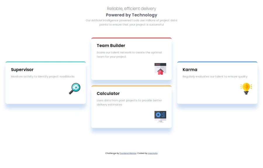
Hi! I see there is a slight problem with your design..
In particular, I don't know if you see the color in the background; there is a slight difference in color. Also, your two icons, that of the bulb and the screen, are reversed compared to the original design.
The size and width of your cards are not the right size. You are missing either padding or marging at the paragraph level from top to bottom.
Finally, the size of your h1 is not the right size.
Marked as helpful1

Please log in to post a comment
Log in with GitHubJoin our Discord community
Join thousands of Frontend Mentor community members taking the challenges, sharing resources, helping each other, and chatting about all things front-end!
Join our Discord