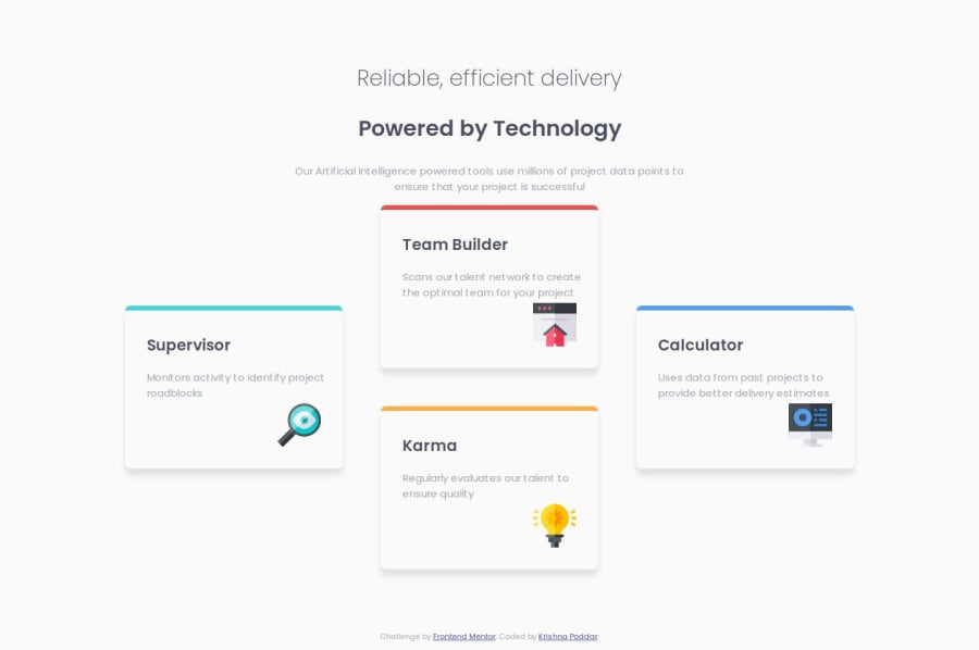
Responsive Four Card template using HTML and CSS
Design comparison
Solution retrospective
Utilization of a grid component for the very first time.
Would love to use it more.
What challenges did you encounter, and how did you overcome them?The styling of the mobile side went fast and I was stuck styling the desktop view.
I faced challenges using grid as I had not structured the the card elements inside another container and tried making the whole container as grid making it congested. Later on I corrected it and the styling became easy. But then I faced the problem aligning the b2 and b3 elements. But putting them in a container made it easy.
What specific areas of your project would you like help with?Any advice on the efficient utilization of grid would be helpful. Apart from that any other advice after looking at my code would help me a lot.
Thank you!!
Community feedback
Please log in to post a comment
Log in with GitHubJoin our Discord community
Join thousands of Frontend Mentor community members taking the challenges, sharing resources, helping each other, and chatting about all things front-end!
Join our Discord
