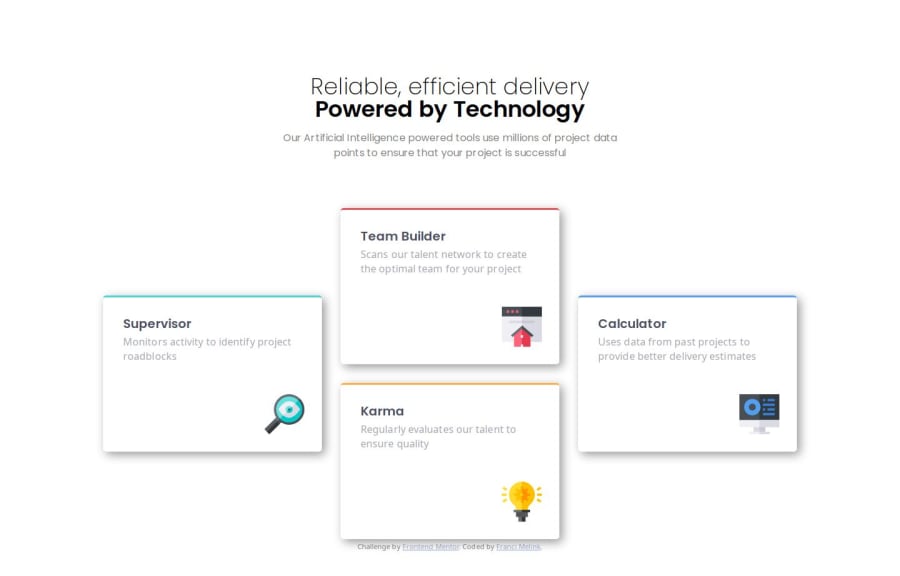
Responsive four card solved with grid
Design comparison
Solution retrospective
Unlike the previous solution, I approached this challenge through "Learning paths." Using suggestions I found in certain articles and YouTube videos, I tried to solve my solution by logically dividing the CSS code into specific logical blocks of files, each with its own function. The YouTube suggestions primarily refer to the Frontend Mentor's recommendations and the video by Andy Bell titled "Be the browser’s mentor, not its micromanager."
What challenges did you encounter, and how did you overcome them?I mainly tried to do what I described above. The next small issue I encountered was with CSS Grid Layout, as I had to relearn Grid. Here, the documentation on the MDN site was especially helpful.
What specific areas of your project would you like help with?As mentioned above, I would like to better follow Andy Bell's approach and master Grid Layout.
Community feedback
- @Yashi-Singh-1Posted 8 months ago
change the background color it is dark gray and footer should have some gap from top and change the font family of box sub text
Marked as helpful0
Please log in to post a comment
Log in with GitHubJoin our Discord community
Join thousands of Frontend Mentor community members taking the challenges, sharing resources, helping each other, and chatting about all things front-end!
Join our Discord
