Submitted 6 months ago
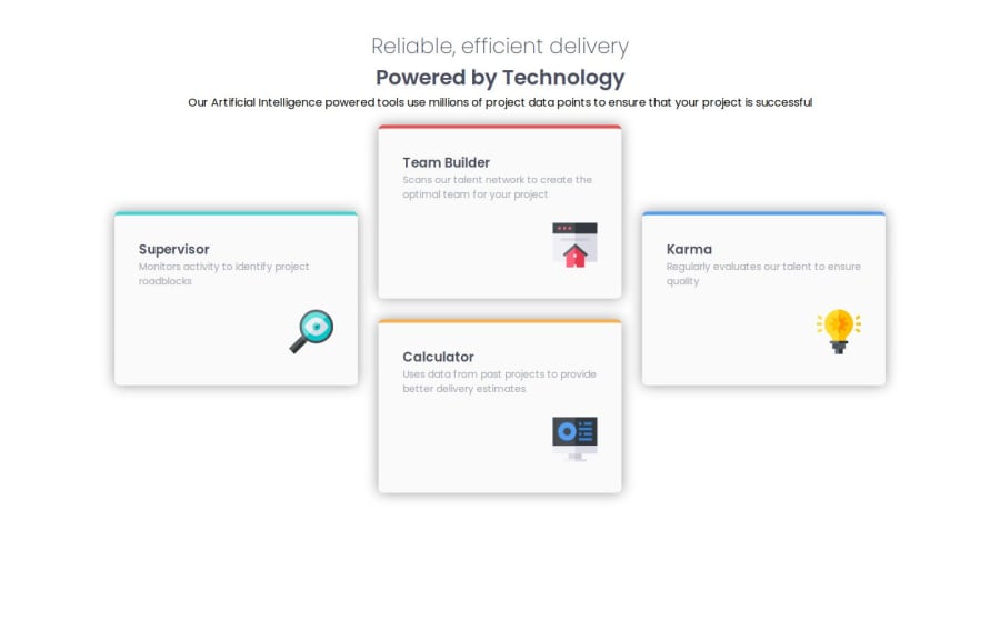
Responsive four card section with flex box & transform property.
@Top-Trekx-Im-gvp-98
Design comparison
SolutionDesign
Community feedback
- P@whiteriver-devPosted 6 months ago
You made the "grid container" with flex instead of grid. I believe the purpose of this challenge is to use Grid not Flexbox. I would recommend going over the Grid section in the learning path and trying to apply that knowledge to this challenge.
However, you still made it work and it looks quite similar to the design. I would just also recommend using gaps and settings widths of the text section at the top so it matches the design.
0
Please log in to post a comment
Log in with GitHubJoin our Discord community
Join thousands of Frontend Mentor community members taking the challenges, sharing resources, helping each other, and chatting about all things front-end!
Join our Discord
