Submitted about 3 years ago
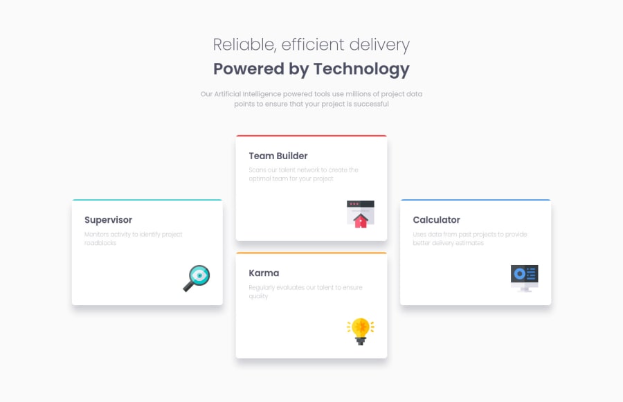
Responsive Four Card Section using HTML and CSS Flexbox
@ereljapco
Design comparison
SolutionDesign
Solution retrospective
I'm not sure if I have used CSS flexbox effectively on this. I would like to hear your thoughts on how I can improve on it. And if you could also provide feedback in naming classes/ids. I'm trying to use BEM and I'm not sure if I'm using it okay.
Hope to hear from you! :)
Community feedback
- @FarisPalayiPosted about 3 years ago
Hey @erelita, good job on this one 👌. The site is responding well to different screen sizes.
A few suggestions from me are:
- The
alt
tag for the icons should be empty, since it doesn't provide any context or extra information; so that assistive technologies can ignore the image. - I think you've used the BEM methodology correctly. One thing I noticed is that,
card-container__border border--one
classes should becard-container__border card-container__border--one
take a look here. But, BEM is flexible, so you can use it any way that works for you. So, it's not a hard rule.(also if it is meant to be reusable throughout the site, then it's not a problem) Here's a BEM cheat sheet website that can be used for reference. There are a bunch of good articles' link as well. - Apart from these two minor things, everything looks excellent.
That's all from me. Have fun coding ✨
Marked as helpful2@ereljapcoPosted about 3 years ago@FarisPalayi Thank you so much! I'll make the alt tag empty on this one and apply to my other challenges :)
And I really appreciate the cheat sheet website for BEM <3
1 - The
Please log in to post a comment
Log in with GitHubJoin our Discord community
Join thousands of Frontend Mentor community members taking the challenges, sharing resources, helping each other, and chatting about all things front-end!
Join our Discord