

Design comparison
SolutionDesign

Community feedback
- @lantiguavPosted 23 days ago
Looks good, congrats.
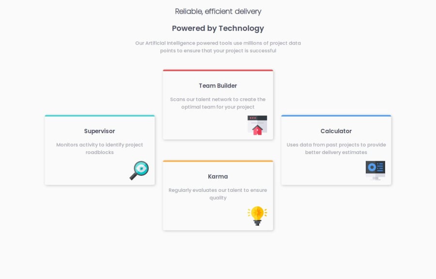
You could make the spacing between cards more consistent by removing
grid-template-rows: repeat(4, 150px);from thegridboxclass, and changingcolumn-gap: 20pxtogap: 20px.By removing the grid-template-rows, you would let the browser figure out how many rows there should be, and the size of them, effectively reducing the space between your "Team building" and "Karma" cards.
gapis a shorthand forcolumn-gapandrow-gap. This will ensure the distance between the cards is consistent, vertically and horizontally.1

Please log in to post a comment
Log in with GitHubJoin our Discord community
Join thousands of Frontend Mentor community members taking the challenges, sharing resources, helping each other, and chatting about all things front-end!
Join our Discord