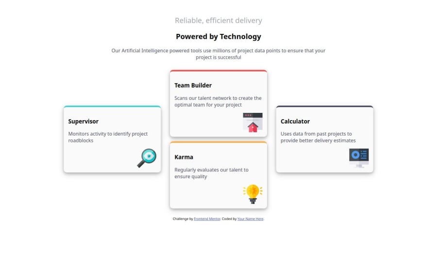
Responsive four-card-section using flex-box and media queries
Design comparison
Solution retrospective
I believe the use of flex-box and media queries to give a responsive design is a great one.
The grouping of selectors to reduce the code.
What challenges did you encounter, and how did you overcome them?I faced the challenge of changing the flex direction to column on smaller screens because I used @media screen and(max-width) { }
But I fixed that by using @media.
Community feedback
- @frost3dWavePosted 5 months ago
Hey, good job on this project, although there are obvious flaws some of which I have listed below, it's great way to learn if you recognize them now & keep them in mind for all your future projects.. Hope this helps.
- you should also use semantic html for the card components too instead of pure
div. :rootshould be the first inside a stylesheet & its also missing a semicolon in here.
:root { --Cyan: hsl(180, 62%, 55%); --Orange: hsl(34, 97%, 64%) --Blue: hsl(212, 86%, 64%); }- although you got the layout right, the approach you used is extremely crude & brute force~ish way. You should recognize when to use which tools/ methods. A grid is way more appropriate here than flexbox for they overall page layout.
- for aligning the images, just having flex on your individual cards would have sufficed here, so you could align it's children using
align-selfthan usingfloats..
.one svg, .two .firstbox svg, .two .secondbox svg, .three svg { float: right; }- for the above snippet too & in other places in your code too, just a mere class would have been enough or a simple tag instead of having so many selectors chained together. you could have the same class on all of your cards & just use it once, it would look way more readable.
@media screen and(max-width:100px) {
    main {
        flex-direction: column;

    }
}
what's the purpose of this, first of all you should use relative units when defining media queries & thus isn't affecting anything & even if it would affect something , you shouldn't need media queries for something as low as 100px.... like your cards are triple the size of the max-width you provided above.
I'd recommend you to just use both HTML & CSS validators, you will see all of your errors & syntax mistakes.
0 - you should also use semantic html for the card components too instead of pure
Please log in to post a comment
Log in with GitHubJoin our Discord community
Join thousands of Frontend Mentor community members taking the challenges, sharing resources, helping each other, and chatting about all things front-end!
Join our Discord
