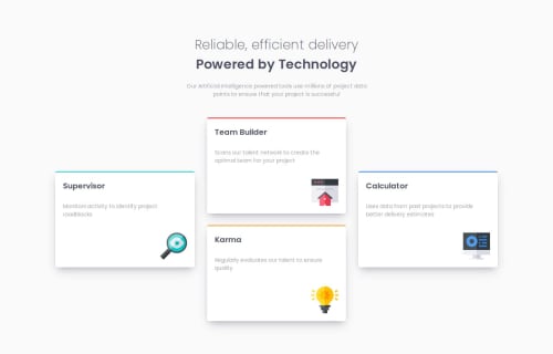
Design comparison
Solution retrospective
i am proud of using css grid with flexbox to customize the layout and make it responsive
What challenges did you encounter, and how did you overcome them?this layout was a bit tricky when you switch between the viewports since the column in the middle has two cards so when you switch to a 2x2 grid it does not fit correctly so i had to make two different grids displaying each one for it's right viewport!
Community feedback
- P@CarlHummPosted 3 months ago
Hey Majdi
Well done on completing the solution, it looks good and responds to each viewport thanks to your media queries.
If you are using CSS Grid you do not need to define columns using elements such as
<div class=".column"></div>
. Instead, columns are created explicitly by you viagrid-template-columns
orgrid-template-areas
, or implicitly by grid and grid-auto-columns.You can view these columns and grid tracks in the browser
- Open up dev tools (F12)
- Navigate the HTML tree under the 'elements' tab and find your <div class="grid">
- In chrome click the small <grid> button next to this and it will show the grid tracks and layout in the preview.
Using this information you can see the grid tracks and columns created by your
grid-template-columns: repeat(3, 1fr)
. As these columns already exist within the max-width of the grid parent, there is no need for individual column elements.To place the cards in the layout of the design, you could opt for the following.
// Desktop .grid { align-items: center; } .cyan { grid-column: 1; grid-row: 1 / span 3; } .red { grid-column: 2; grid-row: 1 / 2; } .orange { grid-column: 2; grid-row: 2 / 3; } .blue { grid-column: 3; grid-row: 1 / span 3; } // Tablet .cyan { grid-column: 1 / 2; grid-row: 1 / 2; } .red { grid-column: 2 / 3; grid-row: 1 / 2; } .orange { grid-column: 1 / 2; grid-row: 2 / 3; } .blue { grid-column: 2 / 3; grid-row: 2 / 3; }
Explanation
The above explicitly sets the position for each card. I have shown two different layouts, one for the desktop view and one for the 50/50 tablet view. However, the only viewport that could benefit from this approach is the one that strays from the default grid behaviour and spans multiple rows (desktop).
So if I were you I would find the point at which it makes sense for this layout to appear and set the desktop styles, and before that use a mobile first approach to generate auto-columns.
This could look like this
.grid { grid-template-columns: repeat(auto-fit, minmax(250px, 1fr)) } @media screen and (min-width:960px) { .grid { grid-template-columns: repeat(3, 1fr); align-items: center; } .cyan { grid-column: 1; grid-row: 1 / span 3; } .red { grid-column: 2; grid-row: 1 / 2; } .orange { grid-column: 2; grid-row: 2 / 3; } .blue { grid-column: 3; grid-row: 1 / span 3; } }
The functions in
.grid
will repeatably create columns to auto-fit the grid container, creating each column to be a minimum width of 250px and a maximum width of 1 fraction of the remaining space, so 1/4 on desktop. This will cause columns to decrease as the viewport is smaller and increase as it grows.The minimum width for the columns (250px) is entirely up to you, and you could take this a step further and use the clamp function.
I hope you found some useful information from this, I am learning myself and this is just one of many approaches, good luck on your future challenges!
Helpful Resources
Marked as helpful1
Please log in to post a comment
Log in with GitHubJoin our Discord community
Join thousands of Frontend Mentor community members taking the challenges, sharing resources, helping each other, and chatting about all things front-end!
Join our Discord