Submitted 7 months ago
Responsive four card page with HTML CSS (Flexbox-Grid)

@ToprakPehleeone

Design comparison
SolutionDesign

Solution retrospective
What are you most proud of, and what would you do differently next time?
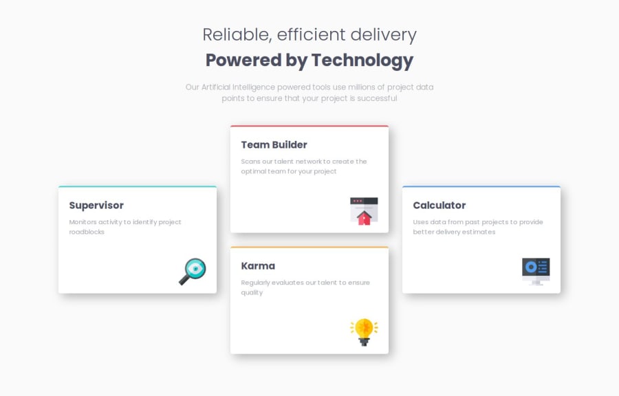
I had little knowlage about grid before this challenge. After watching tutorials and reading documents about grid, i was able to find a solution for desktop and mobile designs.
What challenges did you encounter, and how did you overcome them?Aligning containers like a diamond using grid was a challenge. I used 'grid area' properity to find a solution.
What specific areas of your project would you like help with?Any suggestions and feedbacks on any topics are very much appreciated! Thanks.
Community feedback
Please log in to post a comment
Log in with GitHubJoin our Discord community
Join thousands of Frontend Mentor community members taking the challenges, sharing resources, helping each other, and chatting about all things front-end!
Join our Discord